Last Updated on July 24, 2020
We know that a lot of people are anticipating Stackable version 2 (we are too), so here is a lengthy & meaty update on our progress.
First thing’s off, we’ve updated the live version 2 demo so you can play around with the current progress right away. Be sure to get back here to read up on the updates afterwards.
We’re spending a ton of time developing version 2 and trying our best to get it out the door and into your hands.
During these past few weeks we’ve worked to set a solid foundation for each Stackable block. We want the experience of editing our blocks to be smooth and easy to get used to, so that when you’re off mixing and matching different blocks, the experience would be pleasant all through out.
Blocks Can Either Be Used as a Single Unit, or as a Whole Section
While we were checking out the various sites created with Stackable, we found out that people were mostly using a specific combination of blocks repeatedly across their pages.
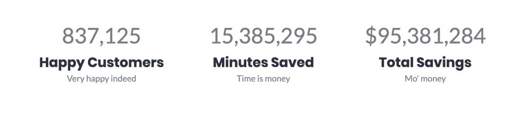
It was very common to see a section in a website composed of a Container Block that only had a native Heading Block followed by a Stackable Block. Think of testimonial sections, customer statistics and feature checklist sections. In other words, a lot of people are creating entire sections with only one major block.
So to make things easier, starting version 2, almost every Stackable block can now be used as a single unit or as a whole section.
As a Single Unit
Right now, almost all Stackable blocks are a single unit. They’re meant to be used as small components and alongside other blocks in order to compose one section of a website.
Take this Count Up Block for example, you can add some content before it or stick it inside a Column Block.
As a Whole Section
In a lot of cases though, we find users just isolating the block above into their own section. To help out this common scenario, in version 2 we are adding in a few options to almost every Stackable block so that they can become whole sections of content. These options are:
- Block Backgrounds
- Block Title
- Block Description
- Top Separator
- Bottom Separator
These new options bump up the robustness of our blocks, and will allow you to isolate your block and turn it into a full-blown website section.
Here are what these new options look like on the Count Up Block:
Block Background, Wide-Width and Full-Width Blocks
When you turn on the Block Background option, the block will go into full-width and you will be able to add a background. The block contents however will still retain its normal width.
While the Block Background option is turned on, you can also set the block contents to be wide-width or full-width using the toolbar buttons. The video below explains this better:
This is a new concept I think is quite unique in Stackable version 2, and will bring our blocks to a whole new level.
Lessen the Block “Jumpiness” with Popovers
While editing Stackable blocks (and in some native blocks), you might notice that when you select a block, the block turns into “editing mode” and suddenly adds some placeholders and url pickers. While these on-screen controls are nice, since the block’s size abruptly changes, the other blocks suddenly move and the entire page jumps.
Here’s what I mean:
This “jumpiness” is honestly quite annoying and we’ve addressed this by removing all the sudden showing/hiding parts during block selection. We’ve also removed all the URL pickers and replaced them with popovers.
This makes the editing experience much more pleasing. We’ve also added in an icon picker popover as an added bonus!
Block Inspector Controls
We’ve mentioned before in an earlier update Version 2: The Future of Stackable that we are grouping together the different controls in the inspector into 3 distinct tabs: Layout, Style and Advanced.
We’ve refined these groupings and defined what goes into each different tab.
The Layout tab is the first tab, and where you will typically start with once adding a block. The options here will drastically change the entire look of the block. Layout options will be here and in the future you will be able to pick from different block designs (this is after version 2).
The Style tab is the next tab, and where most people will spend their time adjusting the different colors, title tags, and typography of every block component. We will try and keep things here as simple to use as possible.
The last tab, the Advanced tab will be reserved for those who really want to get the most out of their block. This is where margins, paddings, vertical alignments, and where fine-grained controls are housed. For blocks that have multiple columns, options for customizing individual columns will also be present.
Optional Block Components
A few people have reached to us asking how to remove buttons and other components from blocks. While this feature is currently present in all Stackable blocks in version 1 (you’ll have to delete the text so that the button won’t show up in the frontend), it wasn’t very intuitive.
So now, we’ve added in a toggle for every block component so that you can disable them easily if you don’t need them.
Typography Controls per Block Text Component
One limitation in version 1 was that you couldn’t change the styles of the text in Stackable blocks. Typically, you could only change the color. But all other specifics, like font family and font size, are set by your current theme.
All that is going to change in version 2. Now there’ll be a standardized set of controls for modifying the styles of any text in our blocks. Titles and descriptions can have different font styles.
We’ve also added in the ability to change the HTML tag for all titles.
Image Shapes
In version 1, all your images were rectangular. You are stuck with whatever dimensions you uploaded your image.
In version 2, we are introducing Image Shapes!
Image Shapes can easily bring boring blocks to life. We’ve provided 50 blob shapes, and these can be applied to images across the Stackable blocks. Shapes are available for non-background images.
Image Shapes are going to be a premium feature.
Image Sizes & Responsive Images
Now, you can have full control on the size of the images you’re adding to a block. You can choose from Thumbnail, Medium, Large or Full. This option is available for background images as well.
Images will now also load responsively. This means that even if you pick the “Full” image size, smaller screens will now load only the smaller version of the image. This new feature will make your pages load way faster in mobile devices.
If you want the technical details, all images in Stackable blocks now use the srcset and sizes attributes:

Responsive Controls
You will now find all across the Stackable blocks these responsive toggle buttons:

You can use these responsive toggle buttons to specify what screen size you’re currently trying to edit for.
For example, if you want your title to be of a different size in mobile phones, click on the responsive toggle, then select the mobile icon, then change your title height.
What’s Next, When Will This be Released?
There are a ton of new things in version 2, and development is at full-steam. We can’t give you a definitive time when version 2 will come out since we’ve blown past the previous date we’ve announced.
We’ll be holding a private beta for version 2 for all Stackable Premium Customers when we’re close to releasing. We’ll be announcing the private beta in our newsletter, so please subscribe using the form at the bottom of this page to make sure you’re notified.
Join the Facebook Group to Get Involved
Please join our Facebook group, and join the discussion about Stackable version 2. We’d love to hear your thoughts and suggestions!
This is great, I think this will improve a lot on current gutenberg limitations. The only thing I’m thinking, is if there will be a way to set a “default” style for the blocks. For example, choosing a “style” or “layout” and leave it as “default” for the new blocks I add, or keep a color pallete for the buttons, or that kind of choices
Default blocks style and the save colors are some of the features that we are eyeing for after V2. ?