Last Updated on July 23, 2021
Happy New Year! To start 2019 with a bang, we are bringing you our most feature packed update yet.
We have enhanced all our blocks.. yes, you heard right, ALL of them.. upping their utility and their customizability to the next level. Update to version 1.11 now to experience it.
“Basic” & “Plain” Designs
Last version, we mentioned that we rolled out the design picker and the new settings for only a few of our blocks, and that we will continue to do this with the rest. We’re happy to say that we’ve implemented them across all of our blocks.
Now you can toggle between a basic design and a plain design for almost all our blocks.
The plain design is very helpful if you want to get rid of a lot of our styling and apply your own CSS customizations. We have also enhanced our CSS class names for every block by implementing the BEM naming convention to make things very easy to customize. You can read more on that below.
The basic design is our signature “boxed” design look. Some of our blocks that didn’t have a boxed look now have it, like the Team Member block and Testimonial block. And we’ve also provided border radius and shadow options for almost all blocks for your tweaking.
Fixed The “Single-Letter Button Bug”

We’ve finally fixed a very irritating bug in Stackable. When you create a button and save your page, only a single letter is shown in the frontend. The level of frustration brought upon by this bug is uncanny since we had a really hard time replicating the error and pin pointing why it was happening.
It’s finally fixed now and everyone can finally start creating buttons in peace.
Open In New Tab
We’ve gotten a lot of requests from you guys for us to add an option to open links in a new tab. We always listen to our users, so we’ve decided to put some time into adding this option for all our blocks as well.
All link fields that you come across will now have a more options button on the right that will show an “Open in New Tab” toggle. Just check it and your links should open in a new tab.
New Block Icons

In our previous versions, our block icons were a little uneven, some were thicker than others, and some were more pointy. In our effort to standardize every aspect of Stackable, we’ve replaced all our block icons with ones that reflect the level of polish that we put in our blocks. Oh, and the new icons look pretty sweet as well.
Better Block Previews
Sometimes, It’s a little bit hard to imagine what your block looks like in the frontend, especially if you have blocks that are flexible like ours. In Stackable blocks, every text is optional, and therefore provides more opportunities for customization.
For example, in the Feature Grid block, you can choose not to have a description, or a learn more link, or an image. What you put in there is all up to you. We have added in placeholders for text and images in the block so that you can see what things you can edit within the block.
In this release, we’ve made it easier for you to imagine how your blocks would look like in their final state. When a block isn’t being edited, all the text and image placeholders that are left blank won’t show up. This is really helpful and this allows you to better see what the block would look like immediately without previewing the page.
Blockquote Quotes

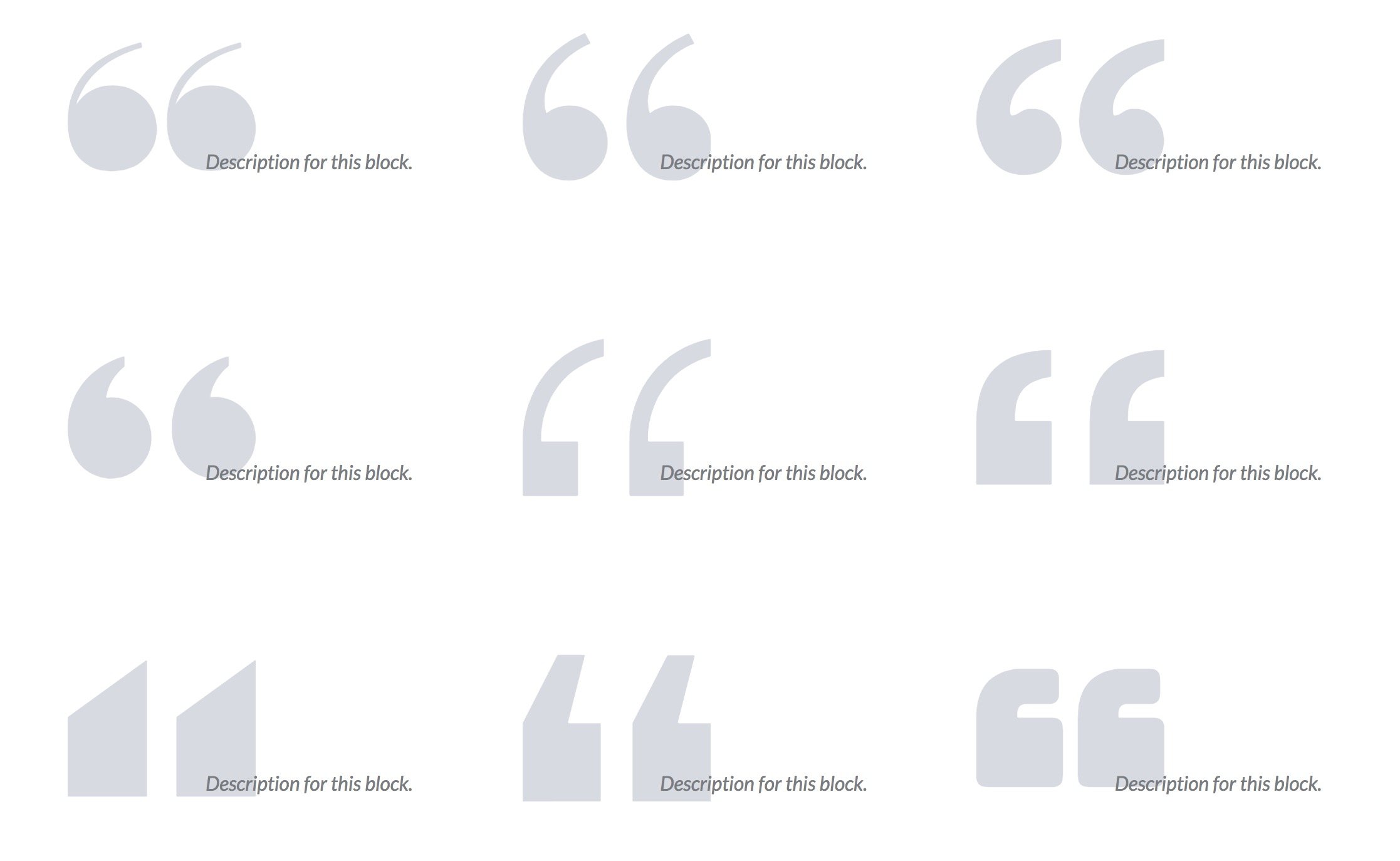
Previously, the Blockquote block only gave you one type of quotation mark to use. Now we provide you with a total of 9 different quotation marks, and we also give you the ability to resize them small or large to achieve different effects.
BEM

This is for more advanced users who really want to customize their blocks.
In this version, we’ve implemented BEM for all our blocks. BEM is a naming convention that stands for Block Element Modifier, it’s mainly used for CSS and it makes it easier for writing, organizing and reading styles.
I won’t go into the deeper details and ideologies of BEM, you can do so on your own, it’s quite interesting.
In short though, it means that every block and element in Stackable now follows a strict class naming convention composed of a few rules. If you’re customizing Stackable blocks with your own CSS, these are the ones relevant to you:
- All Stackable block classes start with
ugb-. For example, our header block isugb-header - All (important) elements inside a block has that block’s class as a prefix followed by a
__. For example, the title of the header block isugb-header__title - All modifier classes specific to a block has that block’s class as a prefix followed by a
--. For example, a header with a plain design has a classugb-header--design-plain - All global modifier classes are prefixed with
ugb--. For example, a level 6 shadow isugb--shadow-6
Other Updates
Here are some of the other notable changes:
- We’ve removed the Pullquote block, since new designs were added to the Blockquote block which can serve as a pullquote as well.
- The button settings panels now won’t close when selecting Plain or Link designs
- Fixed the notification block’s default text color
- The Team Member block previously resulted in an error if a text setting was left blank
- Removed faded text in the Testimonial block
- Fixed accessibility issues in the Expand block, Accordion block and Notification block
- React warnings that appear in some of our components
- Bold & italicized titles malform img tags in the Feature block and Feature Grid blocks
- The background color of the Container block also gets applied to the background color of child blocks.

Hi just updated and broke my site entirely
check it out http://yogakid1.txpro8.fcomet.com/sample-page/
Do you have any quick solution?
Hi, it looks like you’ve fixed things already
Image box is totally broken
I had three columns, and inside each I had an image box block (taking full width)
Now after the update the image appears taking only small slice of the column and no matter what value I put in the width parameter.
Also, now you can’t change the image in image box block after you added it!!
Totally broken
Please revert back the changes you did for this block
Hi Mohamed, others have reported those issues as well, and I’m happy to say that we’ve fixed those issues in v1.12.0 🙂
Loving this plugin but it’s a little vague on how to customize a few things. For example, the blockquote block is only giving me two options for customization: Regular & Large. But on the demo page, you guys are featuring numerous ways to customize this block.
Where would I find in settings to customize this block, or any block really?
Thanks,
Caroline
Hi Caroline,
Each block layout has its own set of controls under them. Click on the dropdown arrow (v) on the right to see them.
For the Blockquote block, we have Basic and Plain layouts. Stackable Premium adds more layouts such as the Centered Quote, Highlight, and Huge.
You can check the premium demo of all the blocks here: https://demo.wpstackable.com/blog-posts/
Hey Benjamin, the plugin is so lovely, thanks for that! Is it gdpr-conform? I can’t find any informations and I can’t imagine in which way data should go in and out …. But I just want to make sure.
Greetings
Hi Carol,
Our blocks don’t gather/transmit any data from your visitors 🙂
Every container has its own class with styles set making overrides difficult and interfering with styles I had previously set. Please consider the impact on designers and developers when pushing updates you find useful but are not easily overridden.
Thanks, we are aware of this and this update last year actually paved the way for block class and structure standardization, so that designers and developers would have an easier time styling moving forward.