Last Updated on August 16, 2022
Getting a high number of traffic to your website is one thing, but converting them to sales is another. Are you struggling to increase your website’s conversion rate? Here are some tips for you!
In the relatively short history of the internet, the eCommerce industry has grown exponentially, with it being valued at USD 9.09 trillion in 2019 and still is expected to continually grow. Due to the undoubtedly fierce competition online, turning traffic into sales has become an increasingly difficult challenge for most website owners.
Luckily for us, there are some tips that may be helpful in boosting websites’ conversion rates.
What is conversion rate?
The conversion rate is a metric used to find out the percentage of website visitors that complete a desired action out of the total traffic. This desired goal may be an account sign up, a sale, or even just filling out a form. Having a high conversion rate would suggest that your website design, as well as your marketing efforts are effective!
To get your website’s conversion rate, you take the number of successful conversions and divide it by the total number of traffic your website is getting. Say for example, in a month your website is getting about a thousand visits, and you close 10 sales within that time period. If the equation is 10/1000, then you get a conversion rate of 1%.
What is a good conversion rate?
A good conversion rate varies depending on what industry or niche you are in. However, websites across the internet have an average conversion rate of 2.35%.
Check out this article from Growcode to check what the benchmarks are for your industry’s conversion rates. If you feel that you’re falling behind, don’t beat yourself up over it and continue reading to learn how you could catch up!
Tips on how to increase conversion rates for your WordPress website
Define your target market
One of the first steps you could take to optimize your website for conversions is to define the personas that you want to market your website to. Analyze the demographics of the consumers in your industry or niche and study about their online behavior, such as:
This will make it easier to figure out what your actionable steps are. For example, you could figure out what days or dates out of the year your target market usually spends. In doing so, you’ll know when you can offer special deals or packages.
Additionally, there are a lot of tools online that help you understand your target market better. Google Analytics is a great analytics tool that allows you to measure your website metrics. You could integrate Google Analytics manually into your WordPress website, or you could use WordPress plugins like MonsterInsights, ExactMetrics, or Analytify. If you utilize social media platforms like Facebook to engage with your audience, then Facebook Pixel tracking could be another alternative to track your analytics.
Take advantage of Call-to-Actions
Call-to-Actions (CTAs) are great marketing devices used for conversion. After all, the goal is for the website visitor to perform a desired action, right? The desired action could be a newsletter sign up, account sign up, free content download, invitation to a webinar, invitation to see products/catalog, and more!
Here are some important factors you should consider in creating Call-to-Actions:
- Make your value proposition obvious. An important factor you should always consider and include in CTAs is the value your audience gets in return for clicking through your CTA. A good example is how a lot of retail eCommerce stores would offer a discount in exchange for joining their newsletter.
Here is an example where the value proposition was made obvious. It clearly shows that clicking through this CTA will grant the website visitor a free trial.

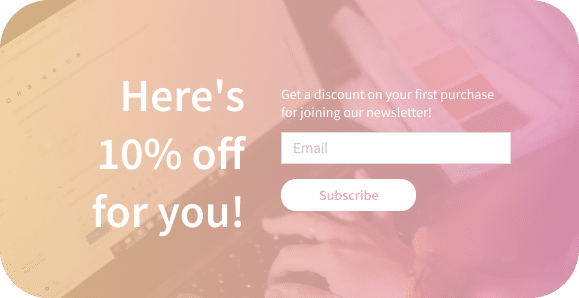
Here’s how you could do it better. Give your website visitors an incentive for performing the desired action. In this example, those who subscribe are given a discount.

- Make your CTA easy to click through. Don’t overwhelm your customers by requiring a lot of fields that your audience will have to fill out. A study shows that the number of form fields you have is inversely proportional to the number of your conversions. Keep it as simple as possible to get the maximum conversion.
Here’s an example of a relatively poorly designed CTA. It’s requiring a lot of effort and information to join a newsletter. This could discourage your website visitors from filling it out and exploring your website even further.

You could make it better by making it easy for them to subscribe. Simply add a button and one field that will allow them to enter their email address.

- Design your CTA so it stands out. The goal is to bring attention to your CTA and make it distinguishable from your other content. You could do this by using different colors and persuasive copy.
Take a look at this very boring Call-to-Action. It’s an invitation that doesn’t seem very inviting and it might not encourage your website readers or visitors to perform the desired action.
We are always on the lookout for passionate and driven people to help us make things happen.
Join our cause today. Get involved now.
Here’s how you could do it better. Make it stand out by using a dedicated section for it. Use a button instead of a simple link and add a photo that will catch the readers’ eyes.

You could also use a pop up! By using a pop up, you will be focusing the website visitor’s attention to one specific area only – eliminating other distractions that may be on your website. This is another way to give your visitors a second chance to convert.
If you’d like some additional tips on how to create effective CTAs, read our article here.
Make navigation functional
There are various parts that you could add navigation on your website – the top navigation, the footer, and even a sidebar. It’s important that you make the most out of these two sections so you could give your website visitors a glimpse of what they could explore on your website. Link to various learning resources, company information, and of course your products and/or services.
In our case, we didn’t want to burden our website visitors with decision fatigue as sometimes, too many choices can be overwhelming. So if you look at how we designed our website header navigation, you’ll see that we made sure to keep it simple–only adding the primary landing pages that might be of interest to our website visitors.
Through this, you guide your website visitors to the next steps of their user journey. This will create a good experience for your visitors and consequently inspire them to perform a desired action.
Speed up your website
This is an underestimated but a very indispensable factor in converting traffic to sales or qualified leads. KissMetrics found that even just a delay of one second in page response could result in a 7% reduction in conversions. It may seem like a small metric, however, it’s a significant decrease in opportunities for conversion.
Nobody likes it when a website takes up too much time to load. I personally have exited a website or gave up trying to access it when I waited too long.
There are various ways you can speed up your website. Optimizing images for the web, choosing a fast host server, and deactivating unused third-party plugins are just a few among others. Read our Speed Up Your WordPress Landing Page (Beginner-Friendly Guide) article to learn about how you could lessen the page response for your website!
Improve your website’s conversion rate
To reiterate, converting web traffic to actual sales or qualified leads is no easy feat, especially with the online competition today. However, there are some steps we can take to optimize websites for conversion, such as
We hope that this was insightful and helpful for those looking for answers. If you have any additional tips that might be helpful, we’d appreciate it if you could share in the comments below!
