
an essential part of web design. A website that provides a great user experience is more likely to retain visitors and convert them into customers. If you would like to improve your website’s user experience, one method that’s worth checking out is adding micro-interactions.
What Are Micro-Interactions and Why Use Them?
Micro-interactions refer to small, subtle interactions that occur when a user interacts with a website or application. These interactions can include things like button animations, color changes, transform & transition effects, or animations and they can be triggered by mouse hovers, clicks, or scrolling. These are great ways to provide feedback to the user or signal an intended action, making the website more engaging and interactive.
Micro-interactions don’t have to be grand or bold, it could be just a simple action but it can create a very big impact to your website’s user experience. To demonstrate this, here’s a side-by-side of a button with just a small change when hovered over versus a static button.
What Are The Purposes of Micro-Interactions?
1. Use Micro-Interactions to Provide Feedback
One of the main benefits of micro-interactions is that they provide feedback to the user. This feedback can be in the form of an animation, a sound effect, or a change in color. For example, when a user hovers over a button, the button can change color to let the user know that clicking it will complete an action.
Below is a great example of using micro-interactions to provide feedback where the button required a user to select a size before being able to add it to the user’s cart. We also liked the addition of the website’s accent colors changing to the selected color 😉
2. Use Micro-Interactions to Simplify Navigation
Micro-interactions can also be used to simplify navigation on a website. For example, when a user hovers over a navigation menu item, a drop-down menu can appear, providing more options for the user. This type of micro-interaction makes it easier for the user to find what they are looking for, improving the overall user experience.
The video example above was taken from Sephora’s website. In it, the section moves as you click the arrows but when you reach the end of the slide, the arrows disappear. It’s a very simple behavior that added intuitiveness and functionality to the website.
3. Use Micro-Interactions to Add Personality
Micro-interactions can also be used to add personality to a website. For example, when a user hovers over an image, the image can zoom in or a tooltip can appear with additional information. These types of micro-interactions add personality to the website, making it more memorable and engaging for the user.
We particularly find this example below by Jonathan Morin really creative. It displays examples of the underlined text when it is hovered.
How to Add Micro-Interactions to Your Website
If you want to do micro-interactions to your website, the native blocks in WordPress do not offer much controls for animation and effects. You will most likely need the help of third-party blocks and plugins. We recommend Stackable (obviously).
Stackable is a WordPress page builder with custom WordPress blocks that make it easy to create full websites. With Stackable’s feature-packed blocks, you have all the tools you need to create an effective user experience. Here’s how you can easily create micro-interactions with Stackable:
Below, we’ll show you how we’ve added micro-interactions to this sample website section:
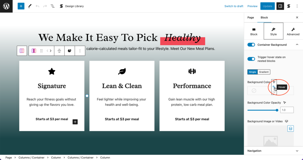
What we first want to do is to add the hover effects to each card. Let’s first select the first column. In the Container Background panel, let’s select the Hover State icon for the Background Color.

Let’s select the Hover option so we can design the hover state of this column.
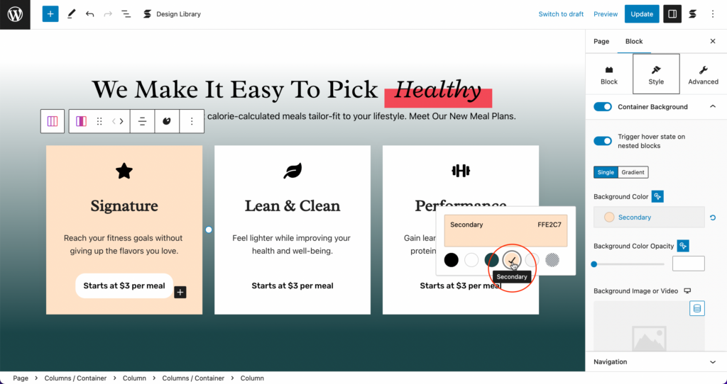
Now, we’re choosing a new color–in this case, we’re selecting a Secondary color from the color palette.
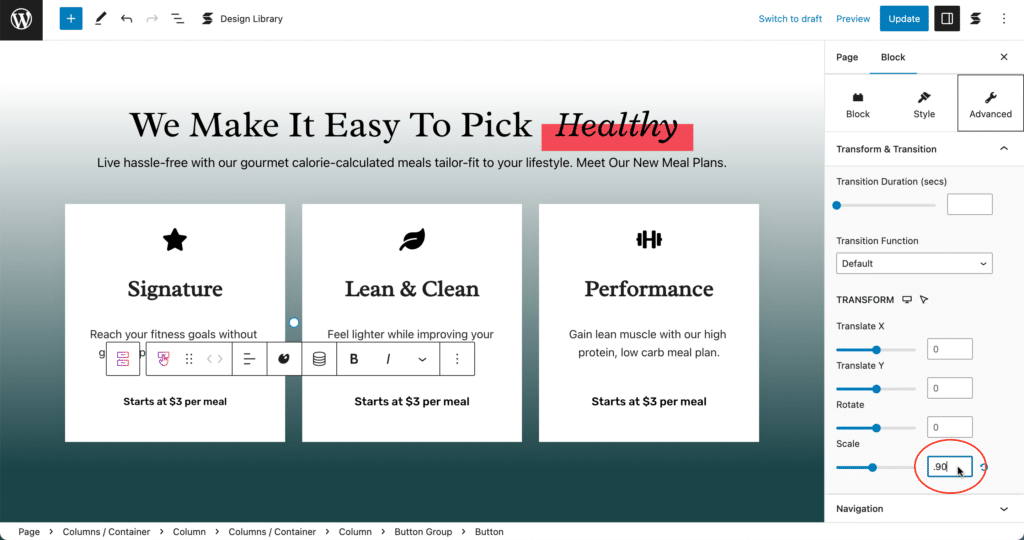
Now let’s move on to the button. What we wanted to do is for it to lift when the cursor hovers over it. Now, let’s do that. Start by selecting the button first:
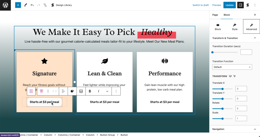
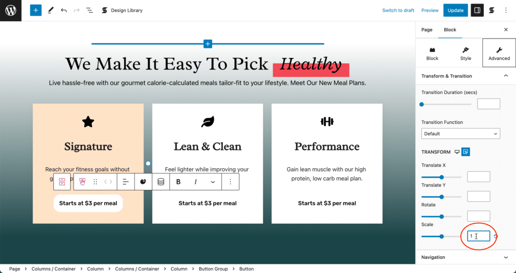
Now, in the Scale option under the Transform & Transition panel in the Advanced Tab, set the value to .90.
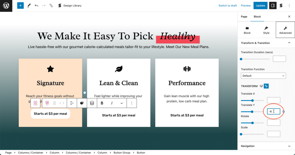
Now, let’s proceed to the Hover state design of the button. Select the Hover option in the Hover State selection.

In the Translate Y setting, set the value to -8. Leave the rest blank. This will give the button the slight lift when the cursor is hovering over it.
Now, let’s carry on to the last Hover State which is the Parent Hovered state for the button. When this is enabled, the action will be triggered when the cursor is on the parent container, and not the element itself–just like how the button became a bit larger in the previous video.
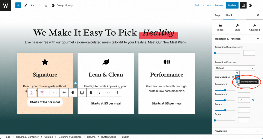
Let’s set the Scale value to 1 since we set the Scale value to .9 in the Normal state. This will give the effect of the button slightly enlarging when the cursor is inside the container.
We’re done with adding the small micro-interactions to the first column. Now, let’s check how this looks like in the front end.
That looks great! However, we still have to do the rest of the columns so that they are uniform. But don’t worry, when you use Stackable, you won’t have to redo all those steps to achieve the same result for the other columns. You can simply use Stackable’s smart copy and pasting. When you select a block, you will find the Palette icon. Select this and you will be able to copy the style of this particular block.

Now, select the block that you want to paste the styles to. Select the Palette icon again, and click on Paint Styles. You will see that the second column has now inherited the styles of the first column. Just do the same for the last column and you will be done!

Let’s look at the finished product. Now you have a section with simple micro-interactions that will give your website visitors a better experience!
Conclusion
Micro-interactions are a great way to upgrade user experience in web design. They provide feedback to the user, simplify navigation, and add personality to a website. When used correctly, micro-interactions can make a website more engaging and interactive, improving the overall user experience.