Last Updated on December 10, 2019
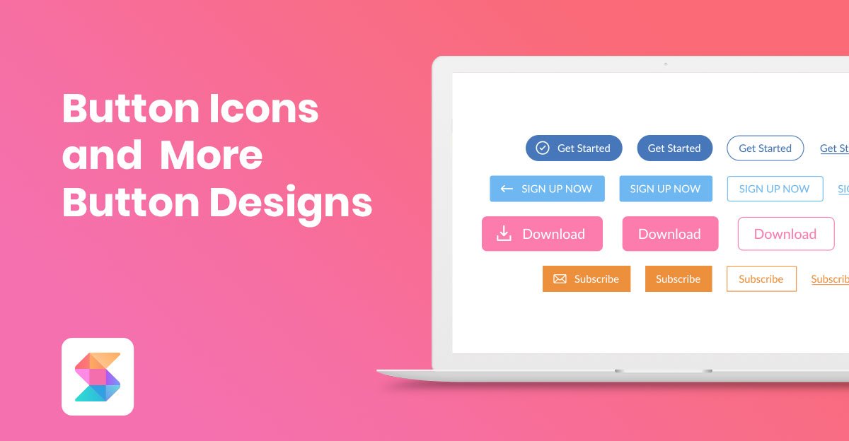
The good ol’ button is even better with more button design options and the ability to add SVG icons.
With Version 1.9 came these great button features.
1,400+ Button SVG Icons

You might have heard of FontAwesome (who hasn’t?), but if not, then know that they practically started the font icon craze a few years ago. They’re one of the leaders when it comes to icons, they have lots of them and they’re constantly improving their collection. So when it came to picking what icons to add to Stackable, FontAwesome was the obvious choice.
We’re happy to announce that we’ve included 1,400+ SVG icons from the FontAwesome library into Stackable (1,412 as of the time this article comes out) that you can choose to include in your buttons.
Before, you can only creating boring text-only buttons. Now, you can bring your buttons to life by adding icons in them!
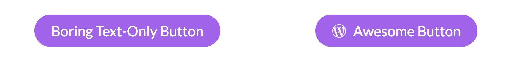
And adding an icon really makes all the difference.
It’s really easy to add an icon into your buttons. Just look for the icon picker setting inside every block that has a button. Simply pick one and Stackable will adjust the size and color that fits the button dimensions:

You’d think that adding thousands of icons would take a toll on the speed of your site. Nope! We keep your frontend lean since we are loading only the icons you actually use. We’re not adding a huge icon font library, so your site will always remain fast.
Button Designs
Previously, we had 2 button blocks: the Button block and the Ghost button block. The only difference between the 2 was their design. That’s it.
It was a little weird that we had 2 blocks that were almost identical except with different designs. So in this version, we’re simplifying things and we’re merging the Ghost Button block with the Button block.
Now from within a Button block, you can switch between a Basic design and a Ghost button. Aside from that, we’re also providing two additional button design options: Plain and Link.
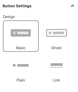
Here’s what the different designs look like:
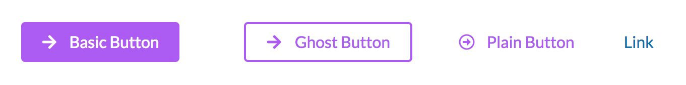
Now you might be thinking that the last 2 designs… are too plain. They’re just text!
The Plain design is a button without any backgrounds, while the Link design is just a regular anchor link.
These 2 designs have their uses.
Since these button designs are available for every block that has a button, then this means that now you’ll get more options for Feature blocks, Call to Action blocks and Header blocks. Instead of being restricted to a button, you can now opt to use a plain link instead in those blocks.
So what happens with the Ghost Button block?
If you already have a Ghost Button block in your page, it would just continue to work fine. You can just leave it there. It won’t however get any new features. For example, you won’t be able to add an icon to it. If you want to use icons or any new feature, you’ll have to recreate your button with just the Button block and pick the Ghost design. Lastly, you won’t be able to add new Ghost Button blocks from now on.
Other Updates
Aside from those, we have lots of bug fixes in this version. Here are a few notable changes:
- If you have an old unsupported PHP version, instead of simply not working or throwing out errors, Stackable will now politely show you a notice that it won’t work until you upgrade your PHP version.
- The Feature Grid block now has a Plain design where it doesn’t have any borders. We’ll be adding those in future updates in other blocks as well.
- We’ve added descriptions for each block.