Progress graphs are usually done in the form of a bar or a circle, showcasing the completion of a goal, achievement of a milestone, or status of a project.
Visual aids have always played a huge role in effective communication. They make content engaging, and information easier to consume
This holds true not only in traditional media but also in web design. Enter progress graphs – illustrations that represent data, milestones, and progress. If progress graphs are incorporated into web design, it could help websites achieve its goals. Whether it’s to increase user engagement or to drive conversion, it could serve as an excellent tool for websites.
As an example, here’s how progress graphs could be useful for a portfolio website:
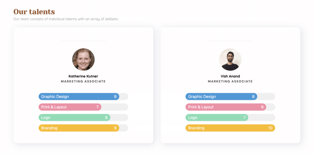
In the example above, it illustrates the mastery of different skills of each individual by using progress graphs.
Another example could be a non-profit organization using a progress bar to depict fundraising efforts.
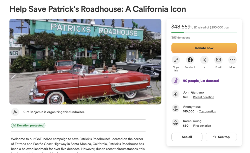
By adding a visual representation of the progress towards a goal, donors might feel more connected to the cause and feel more inclined to donate.
These real-world applications highlight how progress graphs can transform information into interactive storytelling elements, fostering a more engaging user experience.
In this article, we’ll dive into how you can make progress graphs on your website more interactive and engaging.
Tips on How to Make Progress Graphs
Incorporating progress bars and circles into web design requires more than just adding them for the aesthetic. Overuse can detract from user experience rather than enhance it.
Understanding the balance is key; not every progress graph will add value. This section offers tips to ensure your progress graphs truly enhance your web design. We will guide you through creating purposeful and dynamic progress graphs that genuinely benefit your site.
Here are some tips into how to apply these tools effectively:
1. Keep it simple
Design progress graphs with clarity in mind, focusing on essential elements. Excessive decorations might overwhelm or confuse users.
Simple, clear visuals ensure quick and easy understanding for all users. By providing clear and straightforward information, you encourage web visitors to further interact with your site.
Going further, simplicity reduces cognitive load, thus preventing user frustration. Imagine seeing a section, with no text, no percentage, but using decorative icons to describe each progress circle:

How we could improve this is to include a number for each circle, include some text, and use our images as a background. This will not leave the website visitors guessing since the information we’re trying to relay is straightforward.
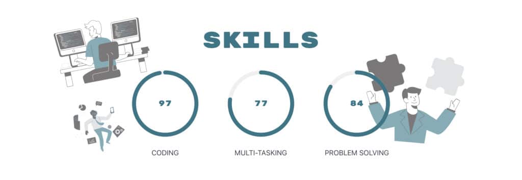
By providing clear, straightforward information we’re encouraging further interaction with the site.
2. Use intuitive colors
Choose color schemes that indicate the progress you’re tracking. Green is the go-to color to signify progress. Like in the example below, the color green is used to indicate how much has been raised against the goal amount

However, you could still use your company’s colors if you want to stick to your branding. Just make sure that the bar background is contrasting from the progress bar’s color like in this variation below:

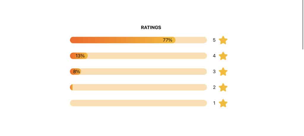
Here is another example, where progress bars were used to display star ratings. In this case, orange to gold hues are used to depict the percentages for each star. These colors are, of course, associated with stars. Using these colors will not only grab the attention of your visitors, it also reinforces the idea of excellence and quality.
3. Provide Context
Each progress graph should come with context, either through text or visuals, clarifying its purpose. For instance, indicate whether it tracks the progress towards a goal or achievement.
Clear context helps users understand the relevance and significance of the progress being shown.
If you own a business and you want to display business performance metrics, including a subtext under each progress bar will help your website visitors understand the message you are trying to convey.
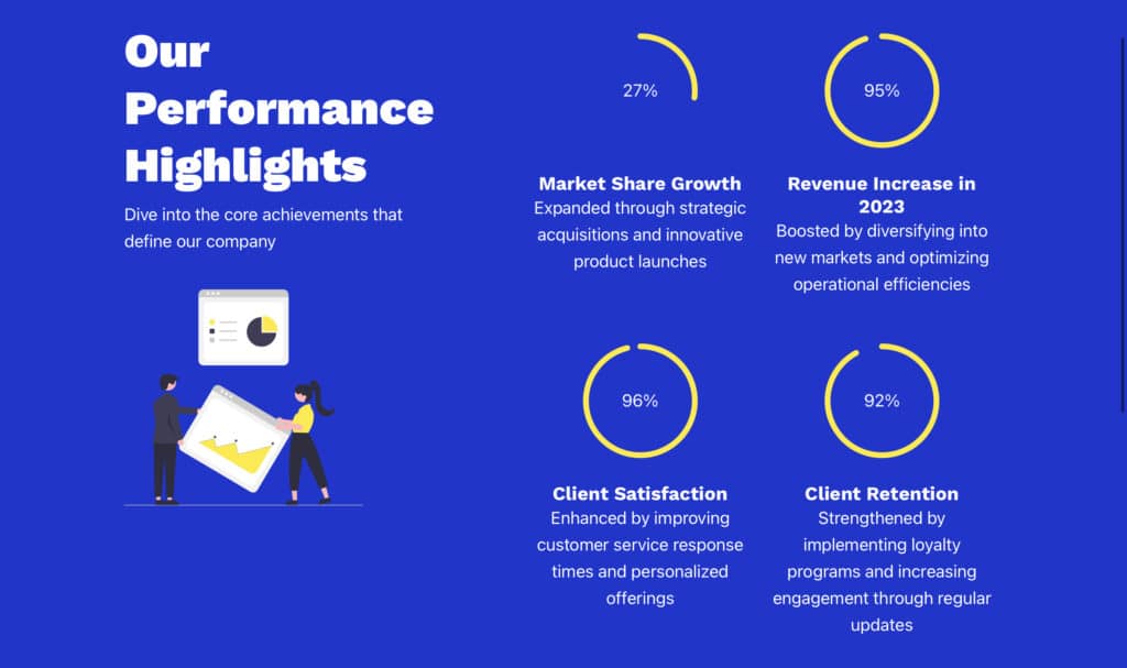
In this example, the subtext provides examples of how the business was able to achieve the metric. Users now have the key information that might matter to them.
Including context in a progress graph clarifies what it measures or what its purpose is, enhancing user understanding and relevance.
4. Incorporate Interactivity
Enhance progress indicators with interactive elements to foster user engagement. Let’s take the performance metrics example above and see how interactivity can be incorporated in the design.
The subtext is hidden by default, however, when the user hovers over each metric, it will appear.
Allowing users to discover more information upon interaction adds value and is a great technique to increase user engagement.
There are many other ways you can add interactivity to your progress graph, such as creating clickable elements, or allowing the graphs to update dynamically when data changes.
5. Add animation
Animate your progress bars or circles to make the user experience lively and engaging. Smooth animations that visualize the filling of a bar or the completion of a circle draw attention and effectively guide users’ understanding of their progress.
Taking the same example, we’ve added an animation to each progress circle so that it completes the progress circle as the page loads.
This transforms static information into an interactive experience, further engaging users.
How to Create Progress Graphs
There are a number of ways to create progress graphs. You can write simple HTML and CSS code to make a simple progress bar or circle. However, if you want to go further, there are a number of plugins that are on WordPress that make it easy to make dynamic and interactive progress graphs.
How to Create Progress Graphs with HTML and CSS Code
Adding progress bars or progress circles is entirely possible using HTML, CSS, and sometimes JavaScript for more dynamic or interactive elements. Here’s an example of a progress bar made entirely with HTML and CSS:
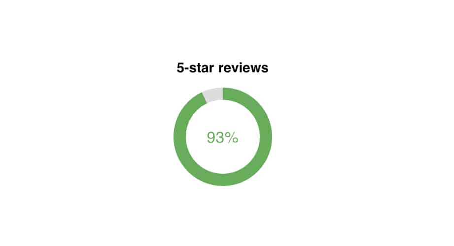
To make this progress circle, we just simply wrote the following HTML code:
<h2>5-star reviews</h2>
<div class="circle-container">
  <div class="inner-circle"></div>
  <div class="percentage">93%</div>
</div>
Then, we plugged in the following CSS selectors to define how the progress circle is going to look like:
.circle-container {
  font-size: 0;
  position: relative;
  width: 100px;
  height: 100px;
  border-radius: 50%;
  background: conic-gradient(#4CAF50 0%, #4CAF50 93%, #ddd 93%, #ddd 100%);
  display: flex;
  align-items: center;
  justify-content: center;
}

.inner-circle {
  background-color: white;
  border-radius: 50%;
  width: 75px;
  height: 75px;
}

.percentage {
  position: absolute;
  font-size: 16px;
  color: #4CAF50;
}
This code creates a circular progress bar using the conic-gradient property in CSS. The circle is divided into two segments: 93% of the circle is filled with a green color (#4CAF50) to represent the 5-star reviews, and the remaining 7% is filled with a light gray color (#ddd) to indicate the incomplete portion. The percentage of 5-star reviews is displayed in the center of the circle, making it easy to see the proportion of positive feedback.
If you would like to expand your knowledge on creating progress graphs with HTML and CSS, we recommend checking out other resources. You can learn about progress bars on W3Schools, which offers clear examples suitable for all skill levels. On the other hand, this Medium article provides a detailed tutorial on how to create a progress circle.
For some people, using HTML and CSS for progress graphs might not be an option, especially if you’re aiming for graphs that are more dynamic. When you want your graphs to be interactive, you might need to dive into something a bit trickier, like JavaScript. This is because JavaScript can make your graphs come alive. If this is not an option for you, then you might find a more fitting alternative in the following sections.
How to Create Progress Graphs on WordPress
There is almost always a plugin for your needs on WordPress and progress graphs are no different. Going this route is much more convenient as you would almost never have to do any coding.
WordPress block libraries and page builders allow you to create and customize website pages without the need for coding. They provide an assortment of pre-made elements, widgets, or blocks, including text, images, and interactive elements like progress bars.
Block librariess and page builders simplify the process of creating progress bars or circles, making it accessible even to those without coding expertise.
With pre-made blocks or widgets for progress bars and circles, users can easily customize the appearance, size, and percentage with just a few clicks. This not only saves time but also opens up creative possibilities, enabling website owners to enhance user engagement and visually represent data or milestones without delving into complex code.
Here are some examples of tools that you can use:
Stackable
Stackable’s progress bar and progress circle blocks enable effortless addition of progress graphs to your WordPress site. Stackable, a leading page builder for WordPress Gutenberg, offers intuitive and versatile Progress Bar and Progress Circle blocks.
These are designed to integrate seamlessly into your web design. These blocks come with extensive customization options, allowing you to align them perfectly with your site’s aesthetic and branding.
You can set the values however you want, and set it to whatever unit you want. Whether it’s percentage, currency, time, or distance, Stackable’s Progress Bar and Progress Circle blocks are the perfect blocks to showcase progress visually.
Stackable is free on the WordPress block directory and it comes with all 30+ custom blocks, 30+ templates, 400+ pre-designed block designs.
Elementor
The Elementor widget for progress bars streamlines the creation of progress graphs on your website. With its user-friendly interface, you can effortlessly design progress bars to match your site’s aesthetic, displaying any kind of progress from skill levels to project milestones.
Elementor is free to install on your WordPress website from the WordPress block directory.
Progress Bar & Skill Bar
The Progress Bar & Skill Bar WordPress plugin enables users to showcase progress visually. It offers customizable features, animations, and easy integration. You can find it in the WordPress Plugin Directory. You can install and active it on your WordPress website for free. However, it also offers pro features with prices starting at $8/year.
Ultimeter
Ultimeter is a WordPress plugin offering various meters for visual representation. It supports customization of colors and styles to match branding. You can also easily set goal and current values with options for percentage or currency units. It’s available for free with additional pro features starting at $39.99/year.
Conclusion
In wrapping up, adding progress graphs to your website does more than just enhance the design—it makes information clear and engaging. These handy tools turn hard-to-grasp data into something tangible, boosting user interaction and connection. By following the tips we’ve shared, you can effectively use progress graphs to not only catch the eye but also drive real engagement and conversions.
