With millions of blogs competing for page views, your blog in WordPress needs to stand out not only through quality content but also through design and engaging user experience.
The design of your blog plays a critical role in how your content is perceived by your website visitors, from the choice of typography and background colors to the layout and overall visual hierarchy.
In this guide, we will cover topics such as the selection of the right WordPress theme, the utilization of page builders like Stackable right within the WP Block Editor, and most importantly, how you can easily create your own WordPress blog page design.
By the end of this article, you will be equipped with the knowledge and tips on how to create a WordPress blog that is not only appealing but also optimized for success.
Benefits of a Well-Designed Blog
A well-designed blog page offers numerous benefits that can significantly enhance your online presence and audience engagement. Here are some key advantages:
Improved User Retention
A cluttered or poorly designed blog can be overwhelming and lead to high bounce rates. On the other hand, a clean and organized layout with clear navigation makes it easier for readers to find and consume your content.
Having an aesthetic and user-friendly blog design can help retain your existing audience and encourage repeat visits. Additionally, incorporating elements like images, videos, and interactive content can break up long text and improve the overall user experience.
Enhanced Brand Image
A WordPress blog design should reflect your brand identity, and a well-crafted layout can significantly elevate your brand’s perception.
A great blog design can help your content stand out, increasing the likelihood of shares and maybe, attracting new readers to your site. Plus, consistent branding elements, such as color schemes, typography, and imagery, can reinforce your brand’s recognition and create a lasting impression on your audience.
Finding the Perfect WordPress Theme
Choosing the perfect WordPress theme for your blog is a crucial step. It’s the foundation of your website that will significantly impact its overall design and functionality.
With thousands of themes available, both free and paid, the process can be daunting. However, by considering your specific needs and preferences, you can narrow down your options and find a theme that’s perfect for your blog.
Exploring WordPress Themes
One of the best places to start your search for the perfect WordPress theme is by exploring theme marketplaces. These platforms offer a vast collection of themes with advanced features and customization capabilities. Some popular theme marketplaces include:
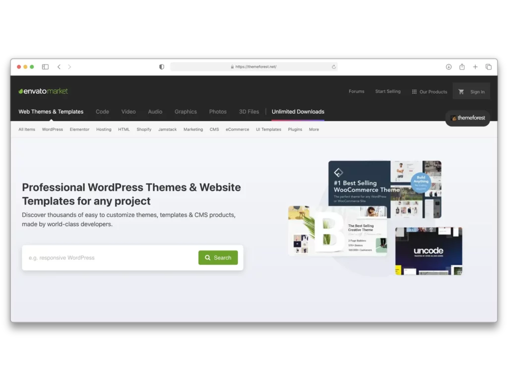
ThemeForest (https://themeforest.net/): This marketplace boasts a wide range of premium WordPress themes, often featuring live previews and user reviews.
WordPress.org (https://wordpress.org/themes/): The official WordPress theme directory offers a vast collection of free or freemium themes, many of which are highly rated and regularly updated by the WordPress community.
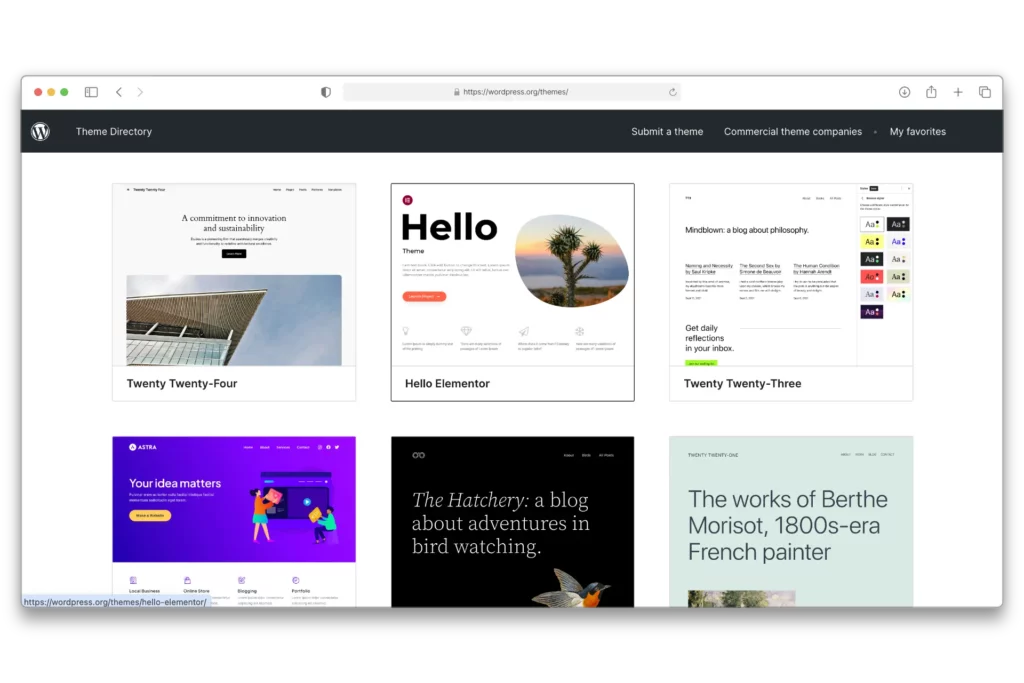
Core WordPress releases themes every year that are built-in to your WordPress website. One great free theme is the Twenty Twenty-Four theme, which sports a modern and minimalistic design. It’s highly customizable in the WordPress Site Editor and it includes block patterns that you can easily insert into your page with just a click.
If you have the budget for it, Premium themes can be an excellent choice for bloggers that are seeking for more features. Premium themes typically offer more advanced customization options, a wider range of layouts, and even provide online support if you encounter any issues.
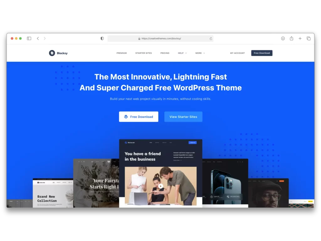
One pre-made theme you could consider is Blocksy, which was designed to work seamlessly with the WordPress Block Editor. It has both a free and a premium version. The free version already includes extensive customizations and starter site templates that could get you started building your website in no time. You can find it right within the WordPress theme directory.
Regardless of the theme that you select for your blog, the key is to select a design that resonates with your brand’s personality and provides an optimal user experience for your audience.
Using Page Builders
Page builders are tools that allow you to create custom page layouts and designs using a visual interface, without the need for extensive coding knowledge.
WordPress comes with a built-in page builder called the Block Editor, which enables you to create pages by combining various blocks, such as text, images, galleries, and more. However, as of writing, it still lacks additional customization options that you might need to design your blog. This is where third-party page builders come in.
One popular page builder for WordPress is Stackable, a free plugin that provides highly customizable blocks to help you create stunning blog page designs. Stackable is designed with a user-friendly interface that works within the WordPress block editor. It offers pre-designed templates called UI Kits, and features that make it an excellent choice for bloggers and website owners who want to create aesthetic blog pages.
Best Practices
When using page builders, it’s essential to follow best practices to ensure your blog page design is visually appealing, user-friendly and optimized for performance. Here are some tips to keep in mind:
Simplicity and Consistency
While page builders offer a plethora of design options, it’s important to maintain a simple and consistent layout throughout your blog. Avoid overwhelming your visitors with too many elements or conflicting styles. Consistency in typography, color schemes, and layout can enhance the overall user experience and reinforce your brand identity.
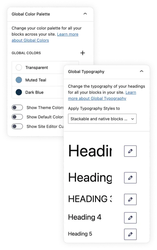
Stackable’s Global Colors and Typography makes this easy for you. You can define a consistent set of colors and typography setting that can be applied across all blocks on a website, ensuring a cohesive design while simplifying the process of site-wide styling.
Mobile Responsiveness
Ensure that your blog page design is mobile-responsive because your audience may access your content from various devices, including smartphones and tablets. The WordPress Block Editor includes live previews for mobile and tablet but lack the capabilities to exactly control or customize website elements for different devices. This is where page builders can also come in handy with additional responsiveness settings.
Performance Optimization
Excessive use of large images, animations, or resource-intensive elements can slow down your site’s loading times. Optimize your images and minimize the use of unnecessary elements to maintain optimal site performance. You should also be mindful of how a page builder impacts your blog’s performance. So be sure to select one that does not add any bloat to your website.
Accessibility
Design your blog page so that it’s accessible to users with disabilities or special needs. This includes incorporating alt text for images, ensuring color contrast, and providing alternative navigation methods for users who rely on keyboard navigation or screen readers.
User-Centric Design
Ultimately, your blog page design should prioritize the needs and preferences of your target audience. Conduct user research, analyze user behavior data, and gather feedback to understand how your visitors interact with your blog. This information can help you make informed design decisions that enhance the overall user experience on your website.
Customizing Your Blog’s Appearance
Customizing the appearance of your WordPress blog is crucial for creating a visually appealing and engaging experience for your readers.
Choosing the Font and Colors of Your WordPress Blog
The fonts and colors you use will shape the overall aesthetic and readability of your blog.
Google Fonts offers a library of open-source fonts and icons that you can use for free. You can easily add it to your WordPress website by adding it manually, embedding it to your website, or downloading a plugin.
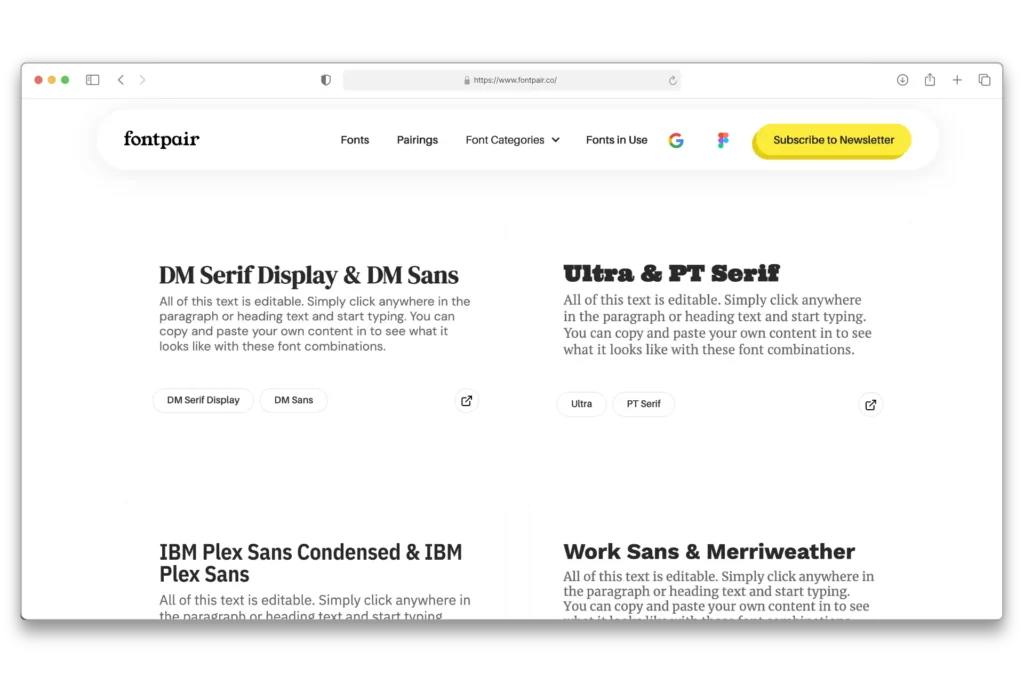
If you’re having a hard time selecting a font, a great tool you can check out is Fontpair which curates Google Font combinations.
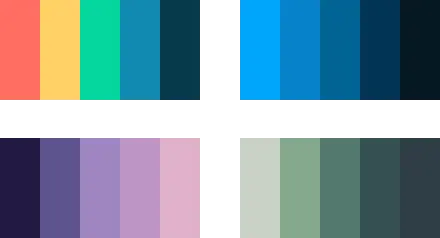
When it comes to colors, create a palette of colors that not only enhances your blog’s aesthetic but also ensures readability and accessibility. Tools like Color Magic AI can help you generate stunning color combos based on a prompt you provide, and Coolors allows you to browse trending color palettes to find the perfect scheme for your blog.
If you already have branding colors, use them consistently. Additionally, make sure to use high-contrast colors to make your content readable. You can use tools like the WebAIM Color Contrast Checker to see if your text remains legible, even for users with visual impairments.
Select the Perfect Layout for Your WordPress Blog
The key to an effective layout is to prioritize the user. How do you want the user to consume your content? How do you want to engage with your audience? These are some questions you should ask yourself in choosing your blog’s layout.
Here are some common layouts you may consider:
Classic
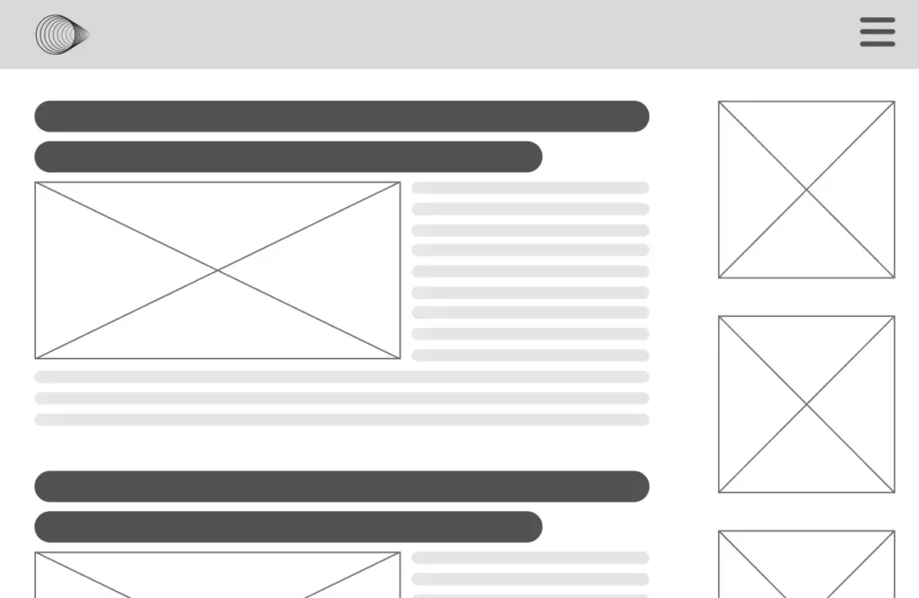
A single column layout that displays your blog posts in reverse chronological order. This makes your most recent post the first one they encounter. This typically includes a sidebar alongside your main content. It’s a great option if you want your website visitors to have a peek at the contents of your posts.
Grid
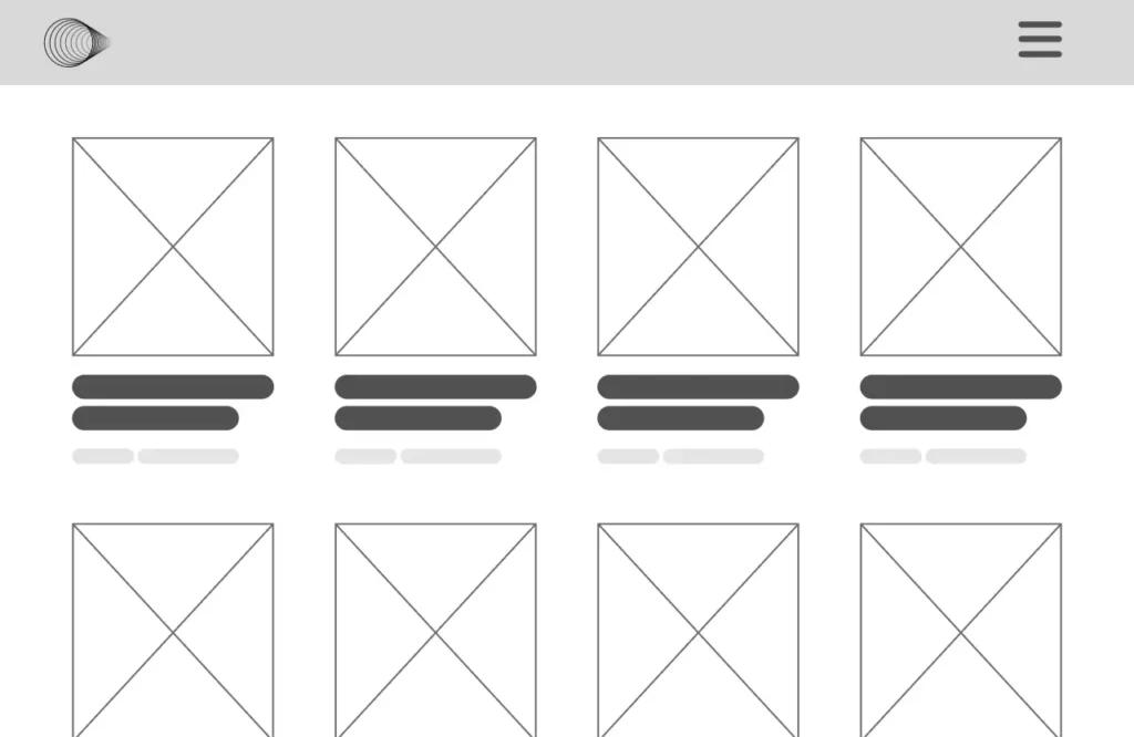
A grid layout arranges your posts in a grid format typically accompanied with the featured image. This layout makes it easy for your audience to navigate through the articles you have on your website.
Masonry
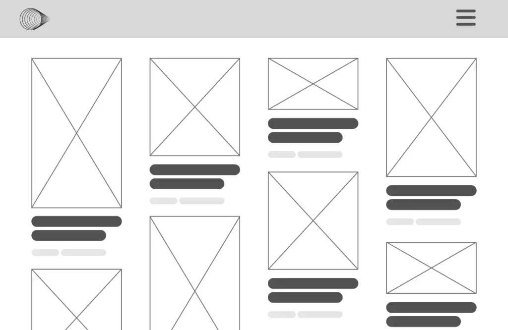
A similar layout to the grid, but it stacks the posts like bricks on top of each other. If your blog is heavy on visual content, then this might be a great option.
Carousel
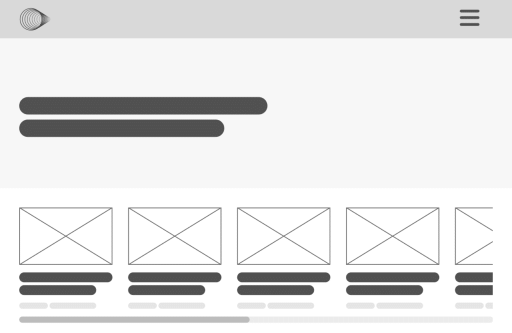
This showcases your blog posts in a horizontal layout that your audience can scroll through. It can scroll automatically so that the website visitors can see what content you offer on your blog.
When you finally select your layout, it’s essential to strike a balance between providing ample information and avoiding clutter. Overcrowding with too many ads, or a jammed sidebar can overwhelm visitors and distract them from your primary content. Instead, carefully select the elements you want to add that will complement your main content and provide relevant, value-adding information.
Optimizing for Different Devices
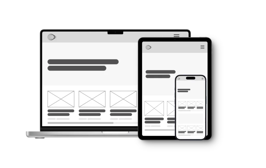
Responsive web design is crucial for providing an optimal browsing experience across various devices. It’s not enough to design your website for desktop anymore, you must ensure your blog page looks great and functions seamlessly regardless of the screen size or resolution.
Typically, there are three main screen types: desktop, tablet, and mobile. Your blog should maintain a consistent layout on each of these screen sizes. To achieve this, you can follow the principles of responsive design, which were first introduced by Ethan Marcotte in a 2010 post on A List Apart.
The goal of responsive design is to offer every user, irrespective of their device, a consistent browsing experience.
Responsive Designs
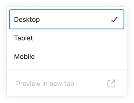
To ensure your WordPress blog is mobile-responsive, you can make use of the built-in WordPress live previews in the Block Editor. This tool allows you to view your site’s design across different screen sizes, including desktop, tablet, and mobile in real-time.
Responsive web design also utilizes CSS units that are relative like EM and REM for fonts; VH, VM, or % for other elements such as images or icons. By default, the Block Editor uses pixels, but you can change this to relative units within the settings to ensure your design scales beautifully across all devices.
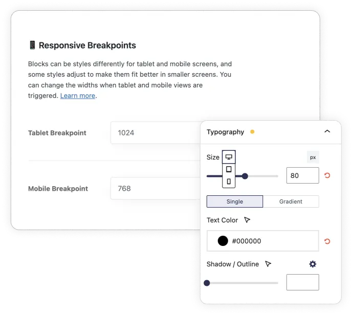
Page builders usually offer additional responsiveness settings that provide granular control to set different values for block elements based on screen size.
Stackable, in particular, also offers the ability to hide or show blocks on desktop, tablet or mobile. You can also adjust responsive breakpoints. to set when your design should adjust to a different layout.
Testing Across Devices
While the WordPress block editor provides a convenient way to test responsiveness, you should still test your site across different browsers, operating systems, and devices.
There are various online tools and emulators available that can streamline this process if you don’t have access to multiple physical devices. Some popular options include:
- Google Lighthouse: Google’s own tool built-in to Chrome to assess your site’s mobile-friendliness
- MobileTest.me: Tests your site across six popular mobile device emulators, including iPhone 5, HTC ONE, and Google Nexus.
- Am I Responsive: Enter the test URL to see results for generic devices. Click inside each screen to scroll and interact with the site.
Additional Resources and Tools
Here are some useful plugins and design resources to consider when creating a stunning blog page design on WordPress:
Useful Plugins
- WPForms: A user-friendly form builder plugin with pre-built templates, conditional logic, and integrations with popular services like PayPal, Stripe, and HubSpot. You can use this to create contact forms, collect email newsletter subscribers, and more.
- Imagify: An image optimization plugin that compresses and optimizes your images, reducing file sizes while maintaining quality.
- RankMath : A plugin that you can use to optimize your content for search engine rankings.
External Design Resources
- Heikei: A website that offers stunning backgrounds and visuals for your blog or website.
- Designspiration: A platform where you can save and explore inspiring designs to fuel your creativity.
- Shots: A website that provides easy mockups for products and thumbnails, useful for showcasing your blog or website design.
- Pexels: A library that offers high quality and royalty-free stock photos and videos.
These resources are at your disposal so you can streamline your design process for your WordPress blog.
Conclusion
In this article, we’ve explored different tips, tools, and resources you can use to create a stunning WordPress blog page design. This includes selecting the right theme, utilizing page builders, optimizing layouts for responsiveness, and using essential design elements like fonts, colors, and responsive layouts.
Now it’s up to you to find that sweet spot between reflecting your brand’s identity and creating a design that resonates with your target audience.