Visual hierarchy is a concept related to visual perception.
In any given design layout, the way things are placed together and next to each other, help us understand how they relate to each other and to the design, based on their order of importance.
For example, if something is in the boldest, brightest color, it appears as the most prominent, and thus more important. Similarly, if something is larger than everything else on the screen, we consider it the most important.

On this website, the company logo takes up the most space, reiterating our subconscious understanding that this is the most important part of this section.
Then, the words ‘Personalized Aviation’ stand out, but in a smaller font. Telling us that this is important too, but we all know which is the hero text.
Understanding these relationships between different objects on the screen helps our brains understand and process information much more quickly and accurately. White space, a staple of minimal design, especially aids the process.
If there were no visual hierarchy, no order to how things are organized on the screen, we wouldn’t be able to comprehend much.
Either everything will look too similar, and the brain will be unable to latch on to anything of significance.
Or, everything will be too loud, overwhelming our processes and making us mentally check out of the experience.
Both these scenarios are bad for business, and design.
How Does Hierarchy Make The Design Better?
The fundamental job of any graphic design is to communicate. As simply and intuitively as possible. That’s why hierarchy and minimal design go hand-in-hand, whether you are creating a logo design or a web page.
Through visual organization, we help users look at the similarities and differences among design elements so users can understand the message behind the web page.
Here’s how hierarchy helps us achieve that:
- Helps highlight the sequence of design elements, so we can understand their order of importance.
- Makes the layout easy to scan.
- Guides the user attention.
- Informs the user journey.
- Communicates the intent of each element and the overall web page.
Examples Of Visual Hierarchy, Both Good And Bad:
Since human beings are visual learners and we are dealing with a visual design topic, it’s better to actually see some examples of hierarchy in action. To learn what to do, and what to steer clear of.
Let’s start with the horrible hierarchy first.
Examples of Bad Visual Hierarchy:
- Berkshire Hathaway: a complete absence of hierarchy
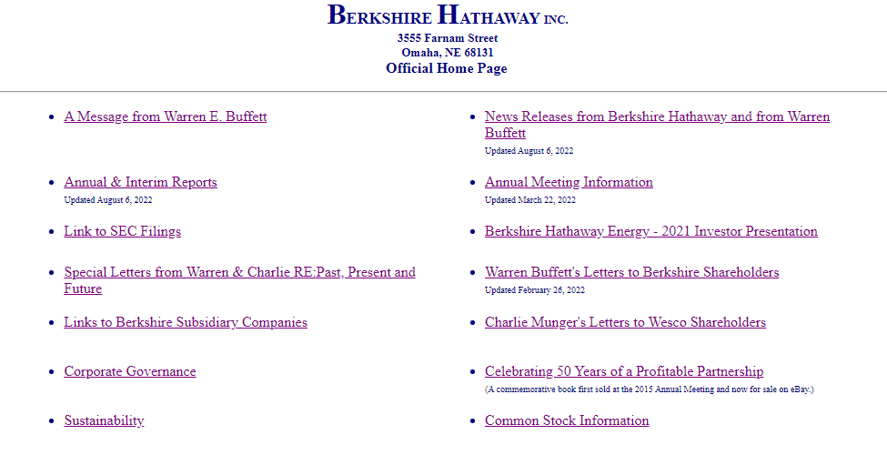
The site looks just like an index page. Nothing stands out and it seems like no special effort has been done to make the page look interesting or readable.
- Yale School of Art: entirely too much is going on
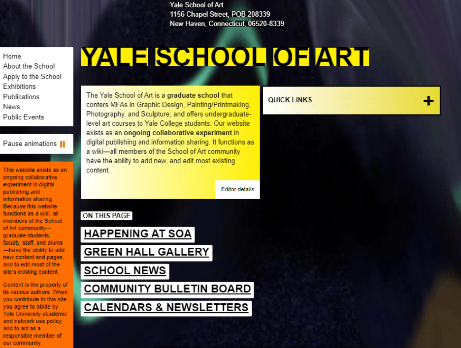
There’s a lot of mish mash of things going on. Where am I supposed to look first? What is the most important thing on this page?
Considering this is a site for a school of arts, it’s not doing much to inspire confidence in its artistic talent. If it weren’t Yale, would you even give it a second thought?
Branding-wise, the design raises questions on what the school can deliver. Hierarchy wise, it’s a confusing mess.
- Suzanne Collins: opportunity lost

Except for the writer’s name, and the book cover in the middle, not much stands out.
The picture of the writer you see on the top-right corner, apparently there’s a rat in the picture, too. But you can’t see it. If the picture were larger, centered on the page, it would have made some impact.
Instead of a bestselling writer’s professional website, this looks like an amateur’s blog.
Now some nice websites with great visual organization.
Examples of Good Visual Hierarchy:
- Spotify Design: similarities and differences
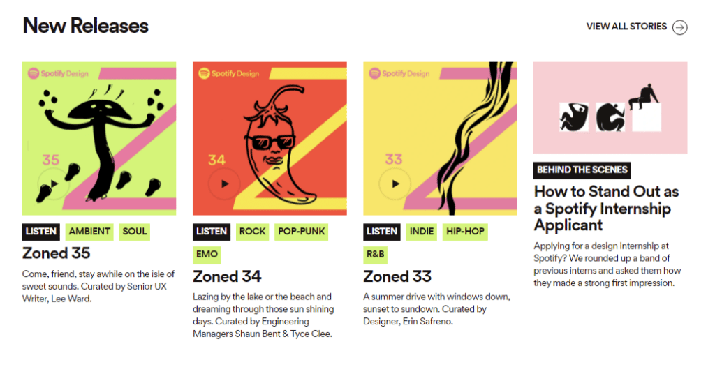
Information is communicated through elements that are similarly sized and highlighted in similar colors. Under each picture thumbnail, you can see the Listen call-to-action highlighted in black while the tags are in green.
Even at a glance, you can spot these groupings and make sense of the objects. From here on, wherever you see white text with a black background, your mind will know it’s a CTA button. You’ll either focus on it or move quickly forward to find something else that you may be looking for.
- Swab the World: simple gets it done

Visual hierarchy makes minimal design that much more effective.
The homepage contains the company tagline in large, cap-sized letters. No way you can miss it. The text animation a bit lower on the page helps you understand the meaning behind the tagline.
- Garoa Skincare: stacked images communicate a message

Images are an important element to organize on site. Here, the rich, textured images of forestry are used as a background to highlight the bare-faced models and their lush skins. The contrast makes you appreciate the unblemished facial skin that much more, which is the entire purpose of this section.
Principles Of Visual Hierarchy
Hierarchy comes with its own set of tools. We have some of the most common ones —- size, scale, color, and contrast. But, there are also textures, style, and repetition.
Let’s see how each helps organize our designs.
Size and Scale

Size is one of the things we notice first. To draw attention to a website element, make it large. Headlines, for example, are alway the largest component on a site. Then, it’s usually call-to-action buttons. Both these elements require our attention and are so highlighted on the basis of scale.
The font size of the body copy, thus, is usually smaller. Subheadings are smaller than the main headings. And so on.
Color and Contrast

Color is another important element that not only draws attention but adds meaning too. Sites usually go with bright pops of brand colors in their CTAs, highlighting the color even more using white text.
Colors that are bright, and contrasts that are more striking attract us before muted and subdued shades. When designing your websites, keep the rich colors to highlight the elements and softer shades for background and stuff.
Even when your design element is smaller, like a CTA, bright colors help highlight its presence.
Empty or White Space

You want to make something noticeable, without resorting to size or color? Surround it with ample white space.
Remove everything else from its vicinity and let it shine alone, center-stage.
White space, or negative space, is the presence of empty space around an object. Just by being surrounded by all that nothingness, the object becomes prominent and impactful.
It’s important to note that white space does not literally have to be white. You can fill that space with a solid block of color and the effect will be the same, perhaps even more pronounced, if you play the contrast right.
The Rule of Thirds

To draw the eye along a certain path on the web page, designers work with grids. Grids help organize things with more intention and purpose. According to the Rule of Thirds, the design section is divided into a grid of horizontal and vertical thirds.
The icon, image, or element that you want to draw the eye to, is placed either on points where the four lines meet (ideally) or on the lines themselves. The idea is to distribute the elements in a ratio of 2/3rd to 1/3rd, instead of dividing the space in half.
Placing important elements according to the Rule of Thirds not only improves the visual hierarchy but also makes the composition more breathable and interesting.
Alignment and Layout

There are two major ways we create site layouts: symmetrical and asymmetrical. Both help us achieve a balance of web content. While the perfectly symmetrical pages look neat and ordered, it can become difficult to retain that perfect throughout the site. Especially when we are talking about things like logo designs. They always cannot be perfectly symmetrical.
Asymmetrical layout makes the design appealing and balanced at the same time. Introducing an element of unpredictability, it helps keep user’s attention rooted to the design and communicates the brand message without weighing down the layout.
Repetition of Elements

Another way we communicate importance and organization is through repetition. When the brain sees the same or similar element spread throughout the website, it starts to group them together, assigning a common meaning to the group.
In the Spotify example above, we saw that repeating the color green across tags helps the user associate that color with tags exclusively. Whenever we see anything highlighted in that shade of green, we’ll have no trouble spotting them as different tags/genres of music.
Proximity and Similarity of Objects

When things are placed together, we consider them part of the same group.
Think of a navigation menu. Each button on the menu leads to a different page but because they are next to each other on the navigation bar, we consider them part of the navbar – not individual buttons.
Anyone looking at those buttons understands them to be part of the group.
It’s the same thing with CTA buttons. On well-designed websites, the call-to-action buttons are all designed and sized similarly. So even if they aren’t close together, the design similarities help us connect them as being together.
The proximity and similarity of objects help make visual hierarchy more branded and sophisticated.
Textures and Style

Things that are textured — such as prints and patterns —- seem more prominent than simple, solid backgrounds.
When organizing your website elements, you can also consider textures and styles to highlight stuff.
Not only highlight in the order of importance but also to make something appear more interesting, rich, and intriguing.
Conclusion
While visual hierarchy is primarily an organizational tool, it’s usefulness doesn’t end there. It also makes the design framework more intuitive and organic. When you follow principles of hierarchy in visual design, you create design spaces that are interesting, clean, ordered, and purposeful — and never boring.
Effective visual organization always aids engagement and improves user journey.
To make it work for you even more, ask your non-designer friends when you do your first hierarchy sketch. Ask them what they see first, what leaps out to them, and what makes them confused about the layout.
That will not only tell you how critical hierarchy is to design but also how beautifully it hides in plain sight, consistently aiding the design objectives.

Very informative article! Visual hierarchy is a design principle that helps the viewer’s eye to focus on what is most important. It is about making the most important content stand out, highlighting, and making it easy for the user to find what they are looking for. The guidelines that you provide are very helpful for me.
Thank you so much Alexandra for sharing it.
Thanks for your insight, Lily! Happy to hear you enjoyed this article 🥳