
Did you come across a website that scrolls left to right instead of the usual top to bottom? That’s called a horizontal layout.
In web design, it refers to a website where the whole content is laid out horizontally. Horizontal layouts are great options for catalogs, portfolios, or brochure websites. Vertical scrolling layouts have been the norm for the past decade, and using horizontal layouts are very out of the box.
Here’s a cool example of a website with a horizontal layout:
We created the example above on WordPress using Stackable, a free plugin that comes with powerful yet lightweight custom blocks that will allow you to create any type of website that you want without writing a line of code! If you want to create a website similar to the example above, then keep reading! We’ll show you step-by-step how to build this scrolling horizontal website on WordPress.
How to Create a Horizontal Layout Design on WordPress using Stackable
Our Horizontal Scroller block has controls and design options that allow you to create anything from sliders to full horizontal layouts. It comes with our free plugin that you can download here.
Once you have Stackable installed on your website, you can now start building your horizontal website!
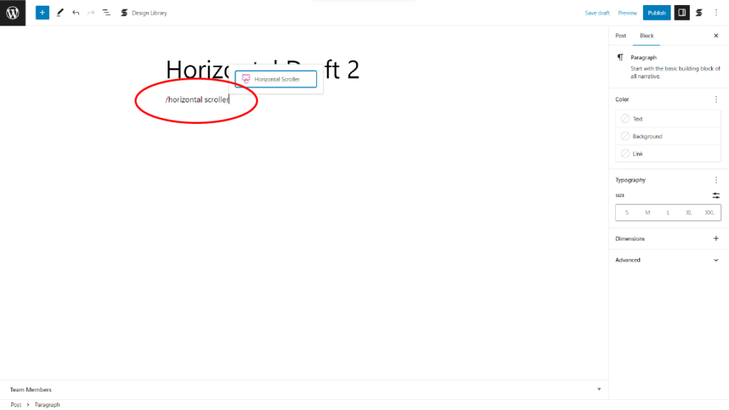
First, let’s add our horizontal scroller block by typing /horizontal scroller.
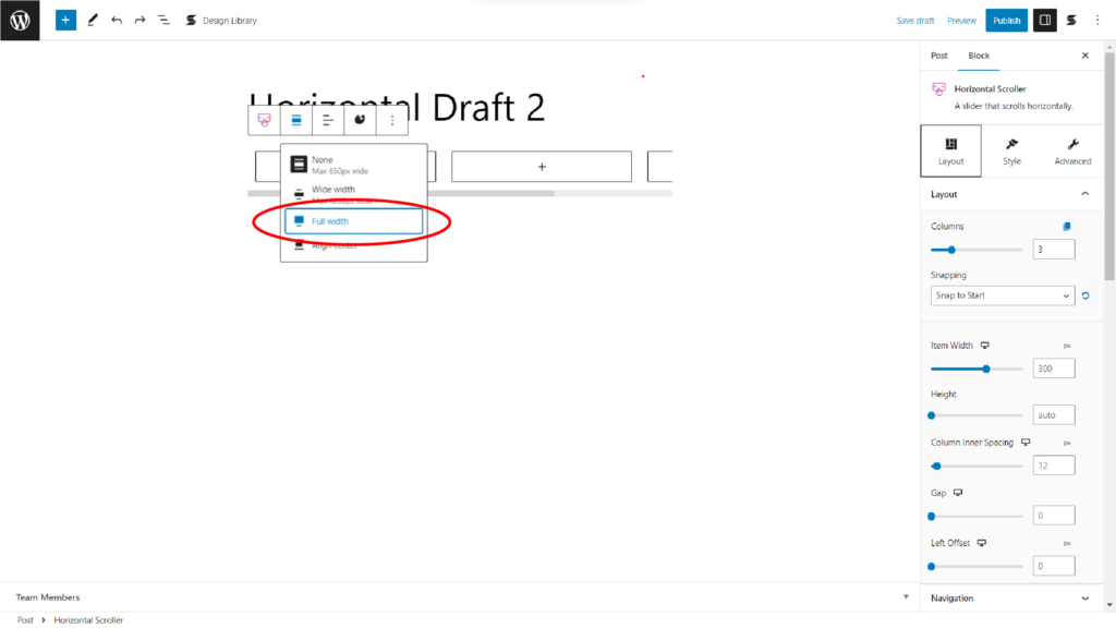
Make the alignment of your horizontal scroller “full width” so that it covers the whole website. You can do this by clicking the Align icon in the Toolbar and selecting the Full width option.
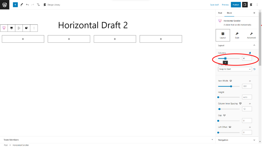
Let’s now add or reduce the number of columns of our horizontal scroller by simply typing our desired number in the text box of the Columns control under the Layout panel of the Layout tab. Or you can also use the slider beside it.
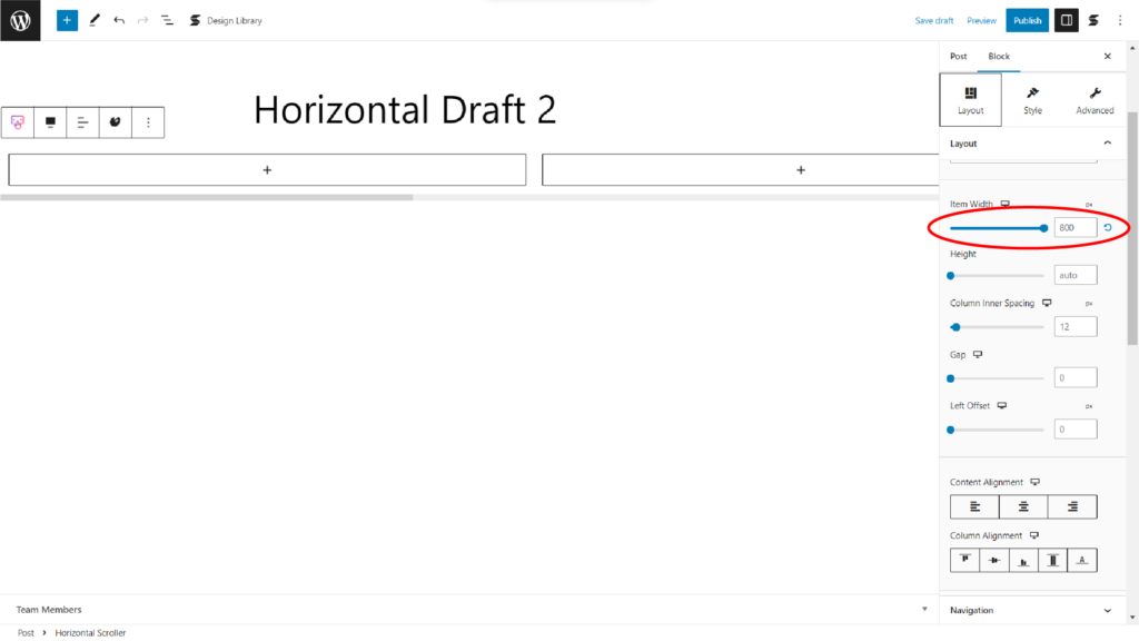
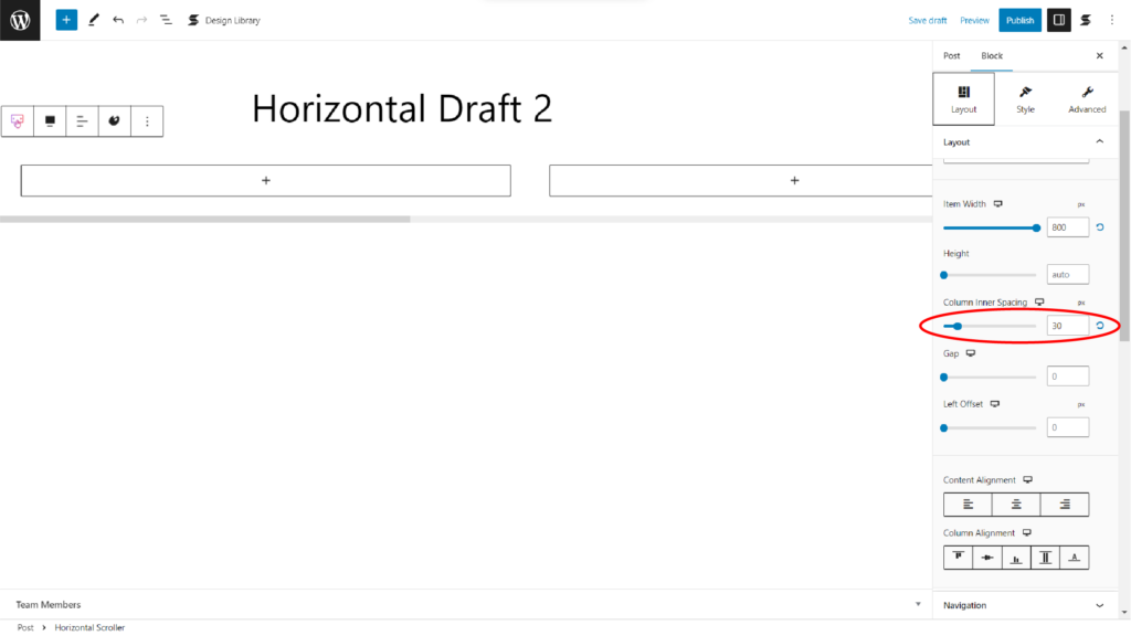
After that, let’s increase the Item Width setting of our horizontal scroller to 800px so we have more space to work on. You will also find this in the Layout panel of the Layout tab.
Now, we’ll increase our Column Inner Spacing value to 30px so we can have a margin for each of our columns inside the horizontal scroller.

Now that we’re done with setting up the layout of our Horizontal Scroller block, we’ll move on to designing each inner column.
Let’s start by adding an Image block inside the first inner column and a Columns / Container block below it. Select the 33 / 33 / 33 variation in the layout picker.
This 3-column container is where we will be putting our text. Now, select each inner column one by one, and set the Column Spacing to 0px in the Layout panel.
Let’s add our image and text. Make sure that the text on the leftmost inner column is aligned left and your text in the rightmost inner column is aligned right.
Now, select the rightmost inner column, and in the Layout tab, you will find the Size & Spacing panel. Select this and locate the Content Vertical Alignment control. Select the third option which is Bottom.
Now let’s style it! Let’s change the typography settings of our text by selecting the text in the leftmost column. In the Styles tab, you will find the Typography panel.
Click the pencil icon beside the Typography controls. For this first Text block, we used the Playfair Display font, changed the Font Weight to 700, and the Font Size to 80px.
Now, in the Text Color control, we’re typing in a custom hex code for a grayish tone.
Next, let’s design the typography for the text in the right column. Select the Text block, and click the Typography controls again. For this text, we’ve set the typography settings to the Poppins font family, 300 for the font weight, and 40px for the font size. We’ve also decreased the line-height to 0.8 and changed the color to the same grayish tone.
Finally, we’re adjusting the sizes of each column to make the first text more readable.
Let’s now proceed to the 2nd slide. Let’s add in a 2-column container first. Then on the right container, let’s add another 2 column container. This is so that if we duplicate the 2 column container inside the right container, it will duplicate downwards. With that being said, let’s duplicate these 2 columns 3 times. After that, insert 2-column containers inside the last 2 Column / Container blocks. These containers are where we’ll be putting additional text.
Don’t forget to set all column spacings to 0. You can do this quickly by copying the styles and pasting them to each container.
Next, let’s put in our image and texts. Let’s adjust the alignment of some texts as well. See in the video below which specific containers we’ve added the text to.
After that, let’s change the typography settings of our text in the Styles tab. Let’s make some adjustments to the layout of the image and columns as well. Let’s also put a spacer at the top of the image to prevent it from moving up.
First, let’s select the Portfolio text. For this, here are the typography and layout settings – Font Family: Playfair Display, Weight: 700, Size: 60px, Bottom Margin: -106px, Top Margin: -30px.
Second, for the Pringles text, here are the typography settings – Font Family: Playfair Display, Weight: 700, Size: 30px.
Third, for the 3D text, here are the typography settings – Font Family: Poppins, Weight: 300, Size: 30px.
Fourth, for the additional text below, here are the typography settings – Font Family: Poppins, Weight: 300, Size: 15px, Line-height: 1px, Text Alignment: Alight Left.
Finally, for the image, set the Height to 400px.
For the 3rd column, let’s duplicate the 2nd column of the horizontal scroller since their layouts are similar. After that, let’s remove some texts and images that will not be needed for this column. Next, let’s rearrange and adjust some containers. Then, let’s add in our new images and texts. It’s that easy!
Now, let’s move on to the 4th column. Since the contacts section has a similar layout with the 2nd column, let’s duplicate the the 2nd column again. Then, let’s move the duplicate to the right most part of the horizontal scroller. Now, let’s rearrange, remove, or add our containers. Next is to add our new texts and images. After that, make some adjustments to your texts by tweaking the typography settings. You can also copy the styles of other texts like what I did in the example below. Finally, make some micro adjustments to the alignment of your texts to make the overall layout look cleaner.
Finally, let’s add a background for our horizontal scroller to make our website look even better. Let’s also remove any unnecessary items in our website such as excess columns in our horizontal scroller.
Finally, why don’t we preview and check out how our website looks?
Wasn’t that easy? Now we have a horizontal scrolling website that’s visually appealing and
Conclusion
Creating a horizontal layout on WordPress can be a great way to enhance the design of your website! By following the steps in our tutorial, you can easily create a unique horizontal scrolling website with Stackable! Now you can make your website stand out and keep visitors engaged.