
Last Updated on June 27, 2022
Learn about how you can give your website visitors a great experience across devices through responsive web design.
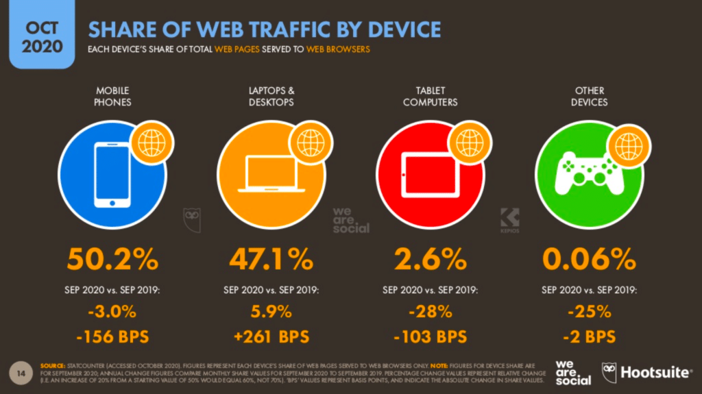
Designing a website solely for a desktop is just simply not enough in this day and age. Just a few years ago, people were predicting that mobile users will be the majority of web traffic. True enough, in a report by DataReportal, a whopping 50.2% of web traffic in 2020 comes from mobile devices. That’s 3.1% more than laptops and desktops.
With this much traffic coming from mobile devices, you would want to make sure that your website is mobile-friendly. You could do this through responsive web design.
What is responsive web design?
Responsive web design is a concept that approaches website design and development in a way that changes a user’s experience on a website according to the user’s viewport, device or platform. The objective of responsive web design is not just to make sure that the design is aesthetically pleasing across all device types, resolutions or orientations. Its objective also includes making sure that the user’s experience is efficient and enjoyable.
Ethan Marcotte discusses that responsive web design is not necessarily one piece of technology. He argues that responsive web design is a mixture of techniques. Responsive web design has three foundational components, namely: fluid grids, media queries, and flexible images.
Thinking Responsively
It’s easy for beginners in web design to have difficulty understanding what responsive web design really is and more importantly, how to implement it. As a guide, here are some questions that Jason Grigsby formulated in his article to help users in designing a responsive website; whether beginner or professional:
- Does it adapt to screen size?
- Does it take advantage of device capabilities?
- Is it accessible anywhere?
- Does it work well?
Responsive Design Considerations
Fluid grids
Make your website adapt to a device’s screen size by using fluid grids. Fluid grids work in terms of proportions. This way, when a layout is squeezed onto a tiny mobile device or stretched across a huge screen, all of the elements in the layout will resize their widths in relation to one another.
The most common resolutions for designing responsive websites are 1920×1080, 1366×768, and 360×640. When your website is being viewed from a viewport that’s too narrow, the design can start to severely break down. This is where media queries come in.
Media queries
Media queries are conditional CSS properties. Through media queries, you are able to set CSS rules that will be executed depending on whether the conditions you have set (e.g. viewport width, orientation) are being met.
For example, you can hide a section from your website when viewing from a mobile device. This is how that media query would look like:
@media screen and (width: 300px) {
.section {
Display:none;
}
}
.section-reviews is what you call a CSS class. This media query dictates that when viewing from a screen that has a minimum width of 300 pixels, it will not display this section by calling the CSS class out and setting the CSS rule Display to “none”.
Learn more about media queries on W3School’s comprehensive discussion on it!
Device Capabilities
Take into consideration what the different capabilities of a device are when designing your website. Touch screens come with different design guidelines than cursor-based interaction.
For example, link hovers won’t work with touch screens since there is no cursor that could navigate around the website. It’s a great design feature for desktop viewing. However, it might become difficult for website visitors to tell apart links from plain text if there are no added design considerations for those viewing from a mobile device.
If you would like to learn more about how you could implement design considerations for different device capabilities, read this article by Thomas Joos in which he discusses different design considerations for touchscreen-based interactions.
Flexible images
Flexible media are relative to the flexible grid as these sizes are usually set as a percentage of a grid. This prevents the medium from being larger than the grids in which they’re placed without sacrificing any of their aspect ratio. In doing so, you are assured that no matter how the page width is changed, the image will always be displayed properly.
Designing a Responsive Website with Gutenberg
Designing a responsive website may seem a bit overwhelming. Fortunately, most Content Management Systems (e.g. WordPress, Wix, Shopify) already have built-in features that help beginners in making websites responsive.
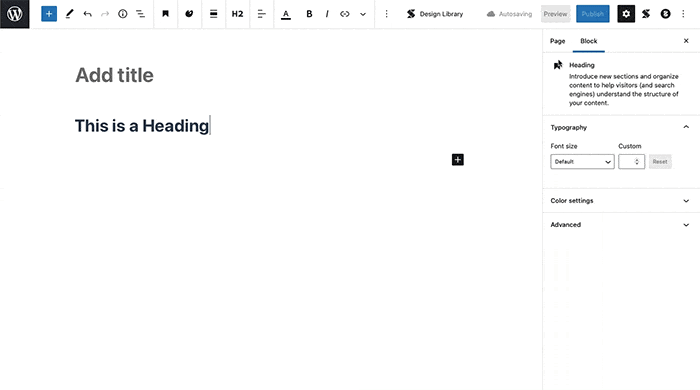
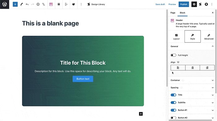
In WordPress’s block editor, Gutenberg, you are able to see how your website is going to look like when viewing from a desktop, tablet, or mobile device.
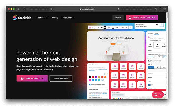
Take it a step further and design stunning websites with Stackable. Creating responsive websites can be as easy as clicking a few buttons to make sure that your website looks flawless on any screen resolution, or platform–be it on a mobile phone, a tablet, or, of course, a desktop.
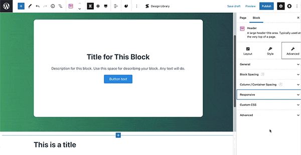
Edit visually and see how blocks look like when viewing from a mobile or a tablet device.
Easily show or hide any elements through our responsive toggle settings.
Learn more about Stackable and unlock our extensive block collection to start creating stunning responsive websites.
Hi, is it posible to have container column reverse order on mobile?
Any suggestions?
Kind regards, Jan
Hi Jan, yes, it is possible to change column arrangement on mobile! Just select the parent column block, and in the Advanced tab of the Inspector, navigate to the Responsive panel and you should see the Mobile Column Arrangement controls.