All About Typography (in Stackable)
STACKABLE BASICS
By the end of this video, you will have a deeper understanding of all the typography settings within Stackable!
In this tutorial you will learn all about typography in Stackable: how to change fonts, change the color of text, and the different settings at your disposal to customize your text.
Blocks that will have typography settings include heading, text, button, subtitle, count up, icon list, number box, and posts.
The properties in the typography panel will generally be the same across the different blocks.
The only difference is that the heading block will have a “Title HTML Tag”.
Inspector Settings
Let’s dissect these typography elements one by one.
All text settings may be found in the Typography panel of the style tab.
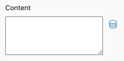
First, the content field. This is where you can input the text for your block in addition to typing into the block itself.
The icon on the right is for dynamic fields. You can use dynamic sources to populate the block.
For example, you want to use the post title as the text to display, simply select that as the field, and click apply. This is so that whenever you make any changes to the field, it will reflect automatically within the block.
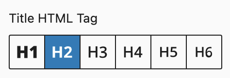
The Title HTML Tag lets you change the HTML tag used for this heading. You have options ranging from H1 to H6.
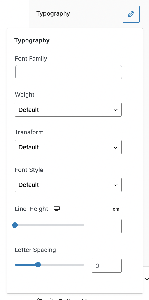
Now let’s talk about the typography options. If you click the pencil icon, a pop-up will appear that shows the different ways you can customize the font of the text
In the font family drop down, you will see all the available fonts that you can change the text in to.
The font weight defines the thinness or thickness of a font. You will have the option to set it from 100 to 900, normal or bold.
Transform can be used to make text appear in all-uppercase or all-lowercase, or with each word capitalized
And the font style is a typeface variation that can make the text appear normal, italic, or oblique.
Next is the line-height, which determines the size between the lines of text in a section.
Notice that there is a desktop icon for this property. By clicking this icon, you will see the different viewports for which you can edit the block’s settings. This is called the responsiveness settings.
Moving on to the letter spacing setting, which determines the space between each letter.
You also have the option to size these properties in PX or EM.
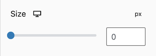
After the typography properties, you will see the size setting. You can adjust the font size using the slider or type the value you want in the field. You have the option to use pixel em or rem sizing. You also have responsiveness settings for this property.
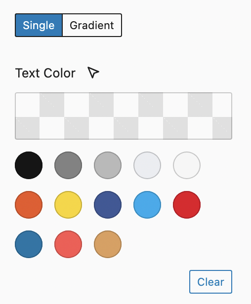
After size, you will see the text color options. You may change the color of the text using the color palette. These are usually colors inherited from your theme’s color settings or you could set these colors in the global color palette settings when you click the stackable icon on top.
You also have the option to select a color using the color picker when you click the custom color button.
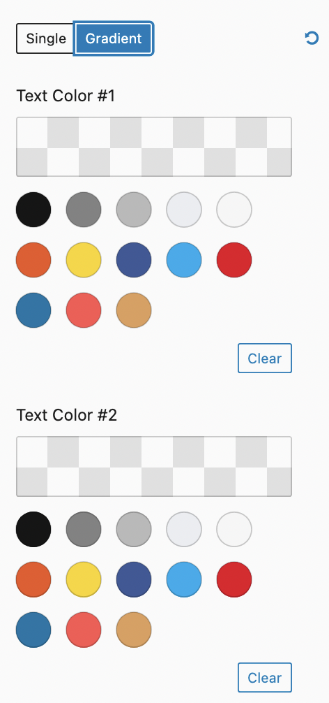
For premium users, you have the ability to use a gradient for your text color. Simply select the two colors you want, and adjust the gradient direction in degrees, if necessary.
Lastly, you can add some shadows/outlines to make your text stand out.
And we’re done!
Those are all the ways you can design the typography on Stackable. We hope this was helpful for you.
Related Articles & Documentation
How to Customize Blocks
PREVIOUSLY IN STACKABLE BASICS
Learn the different ways you can customize the blocks you added through the inspector and toolbar.
How to Use Image Settings
NEXT IN STACKABLE BASICS
Master image settings within Stackable and you will create stunning websites in no time!