
As we start 2021 with hope, we got to say that we all deserve a pat on the back for surviving 2020!
The previous year changed the way we live and work. From Zoom meetings to abruptly modified business strategies, we’re continually adapting to changes introduced by the year that felt like a decade.
Now, as the market evolves, your web design arsenal should also adapt to the latest trends, helping you start 2021 off on the right foot. Consider new consumer behaviors, current web technologies, your audience’s computing device of choice, and more.
Let’s go through 7 web design and development trends that you’d want to watch out for in 2021 and beyond…
Higher Page Speed Expectations
Your website load time or page speed will make or break your site. While you’re probably not hearing this for the first time, it’s critical to reiterate this as it will heavily affect your SEO rankings and conversions in the coming years.
As we expect the next billion internet users, websites should load quickly regardless of the visitor’s internet speed or the performance of the device they’re using.

From Google
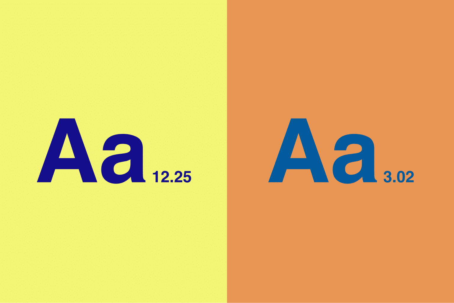
To add, research suggests that the majority of mobile site visits are abandoned if it takes more than 3 seconds to load the page.
As you design your site, choose tools that are optimized for speed. To check the performance, you could use a tool like Google’s PageSpeed Insights.
Greater Accessibility Requirements
Accessibility has always been important. As we anticipate the coming years, prepare for stricter standards in terms of making your website available and convenient for everyone.
Census Bureau indicates that over 57 million Americans have a disability. They could be experiencing visual, dexterity, or hearing impairments.
On top of this, consider how essential services are moving online faster due to recent events. From online shopping to education, websites ought to cater to everyone regardless of their abilities.
Not only for social good, following accessibility standards means avoiding lawsuits in the future.
Don’t forget using Alt Text for images, clear color contrast, and keyboard navigation support.
Easy Mobile Navigation
In relation to earlier points, according to Statista, there are over 3.8 billion smartphone users in the world today.
As you make your website mobile-friendly, keep ergonomics in mind. The most popular smartphone display size is between 5.5” to 6”.

From Statista
Considering the typical smartphone experience, enable your mobile visitors to easily reach call to action and navigation buttons.
Tailor how your pages look depending on the reader’s device. You’ll want to optimize how a page appears and behaves on a desktop, tablet, or mobile device.
If you’re using modern web design tools, responsive behaviors are typically available out of the box. Plugins like Stackable, offer Live Responsive Editing which allows you to toggle between Desktop, Tablet, and Mobile views instantly.
While web design tools may take care of the heavy-lifting when it comes to the visual mobile requirements, it helps if you also take into account the ergonomics of your design by testing it out on actual smartphones and tablets. It’s not enough that a page renders properly on various mobile devices. You’ll want to test if it’s thumb-friendly and comfortable to use in order to boost conversions.
Use of Microinteractions
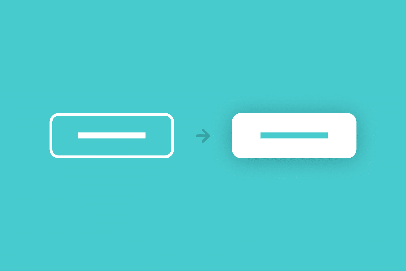
According to Dan Saffer, “microinteractions are contained product moments that revolve around a single use case — they have one main task.”
These tiny details can make a big difference, especially considering the quality of user experience that your website visitors expect these days.
Like Dan described, we’re surrounded by microinteractions every day that we don’t notice it until it stops working. While subtle, they contribute to delight.
To start, consider using simple hover animations. This increases the feeling of interactivity and makes your website feel more engaging.
If you’re using Font Awesome on WordPress, applying microinteractions should be a breeze as they support animating icons..
Prominent Fonts
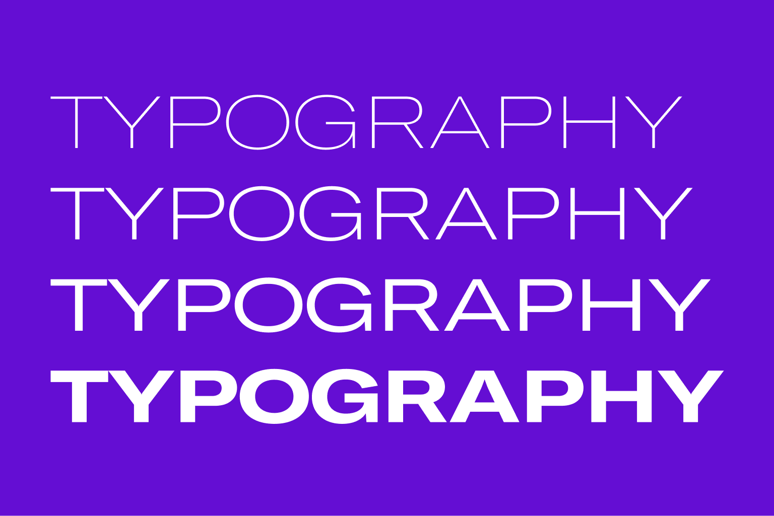
Bold fonts are now more commonly used to emphasize your message without having to focus on graphics too much.
This is especially helpful for abstract ideas or services that don’t involve tangible goods.
Prominent typography enables words to define the visual design. On top of identifying a heavy typeface, you could use larger font sizes.
If you design with the right font, your page’s section above the fold can even be text-only. This allows you to skip hero images and still make your landing page look inspired.
Modern Minimalist Designs

While modern designs are aesthetically pleasing, they support the user experience in more ways. EyeQuant’s research suggests that a clean and clear website design results in a lower bounce rate.
Keep your page clean and simple.
With fewer distractions, it will allow your users to focus on their goal, whether it is to purchase a product or inquire about your service.
Keeping things minimal doesn’t mean slacking off in terms of design. It’s more about mindfully identifying the few elements that deserve attention.
For ideas on how to achieve modern minimalist designs for your website, there are WordPress plugins that provide pre-made designs. You can check out some minimalist UI Kits to start you off on the right direction.
Lots of White Space

Also known as negative space, white space refers to blank areas between design elements like words and pictures.
The liberal use of white space will allow you to highlight calls to action, make your pages easier to read, and keep your website looking nice and tidy.
Define your go-to sizes for gaps and paddings so you won’t have to make this decision every time. If you’re using Gutenberg, you could use advanced columns and grid blocks to easily customize white spaces.
Over to You
While some trends may come and go, your goal is to deliver an outstanding experience for website visitors. You’ll want to keep up with the latest in order to boost engagement and optimize for search ranks.
If you build sites on behalf of clients, show stakeholders that you’re regularly updating your practices.
Stay tuned for more tips!
Looking to make the most out of WordPress? Download Stackable for free.