As web design continues to evolve, it’s important to understand the different CSS units at your disposal. CSS units are essential to create effective, responsive, and accessible web designs.
In this article, we’ll dive deep into the various CSS units available, their characteristics, and guidelines on how to choose the right unit for various design needs.
Introduction to CSS Units
In web design, CSS units are measurements used to define various properties such as width, height, font size, margins, paddings, and more. There are two main categories of CSS units: absolute units and relative units.
Absolute Units
Absolute units in web design refer to measurement units that have a fixed value and do not change based on the dimensions of another element, the viewport, or user settings. In web design, there are two main units that are used:
Pixels (px)
Pixels are the most commonly used absolute units. In digital displays, a pixel is the smallest controllable element. Using pixels gives you precise control over the size and positioning of elements. However, it lacks flexibility on different display sizes and resolutions.
Points (pt)
Points are typically used in print media, where 1 point is equal to 1/72 of an inch. In web design, it’s generally recommended to avoid using points, as they don’t scale well on different devices.
Inches (in), Centimeters (cm), Millimeters (mm)
These are real-world measurements and are not practical for web design, as they can vary greatly depending on the screen size and resolution.
Relative Units
Relative Units are dynamic and are calculated based on the dimensions of another element or the viewport.
Em
The ‘em’ unit is relative to the font-size of its cosest parent element. For instance, if the parent element has a font size of 20px, then ‘1em’ is equal to ‘20px’. Ems are great for scaling typography and maintaining proportional spacing and sizing.
Rem
Similar to ‘em’, ‘rem’ stands for “root em”. It is relative to the font-size of the root element, usually the ‘<html>’ element. This unit is very useful in building responsive designs, as changing the font size of the root element will proportionally affect all elements defined in rems.
Percentage (%)
Percentage values are relative to the parent element. For example, if a child element has a width of ’50%’, it will take up half the width of its parent. This is extremely useful for creating fluid layouts that adapt to different screen sizes.
Viewport Units: vw, vh, vmin, vmax
Viewport units are relative to the viewport size.
- ‘vw’ (viewport width) is equal to 1% of the viewport’s width
- ‘vh’ (viewport height) is equal to 1% of the viewport’s height.
- ‘vmin’ is equal to 1% of the viewport’s smaller dimension (width or height).
- ‘vmax’ is equal to 1% of the viewport’s larger dimension (width or height).
These units are especially powerful for creating responsive designs that adapt to the viewport size.
Choosing the Right Unit
In choosing a CSS unit for the content on a website, you must first define your goal.
Each unit has its own set of properties and behaviors that can be advantageous and disadvantageous depending on the context. Here are reasons why one should use different CSS units for different types of content:
Precision
Sometimes, designers might need to use precise measurements for elements like borders, shadows, or fixed-size components. In such cases, using pixels is the best option as it allows for fine-tuned control over the element’s size.
Suppose you want images on a webpage to have a border around it. Here’s an example of a CSS code that you will add to your CSS stylesheet:
img {
   border: 5px solid #ddd;
   border-radius: 20px;
   width: 300px;
}
Now whenever an image is added to your website, it will look like this:

Responsive Design
Relative units like percentages, em, rem, vw, and vh allow the content to adjust based on the screen size or font settings. This is particularly useful for text content, layout containers, and images, as it ensures that they scale appropriately on different devices.
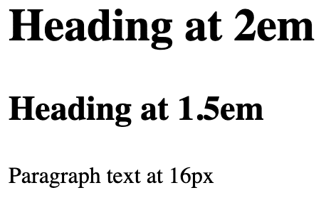
For example, we’ll use the em unit to determine the sizing of our headings. Here’s how the CSS codes would look like:
html {
   font-size: 16px;
}

h2 {
   font-size: 2em;
}

h3 {
   font-size: 1.5em;
}
Now here’s how the text would look like on a webpage.

User Customization and Accessibility
Some users might have their browsers set to display text at a larger size for readability. Using relative units such as em and rem for typography ensures that your website respects the user’s settings and remains accessible.
For example, we’ll use the em unit to determine the sizing of our headings. Here’s how the CSS codes would look like:
html {
   font-size:16px;
}

h2 {
   font-size: 2em;
}

h3 {
font-size: 1.5em;
}
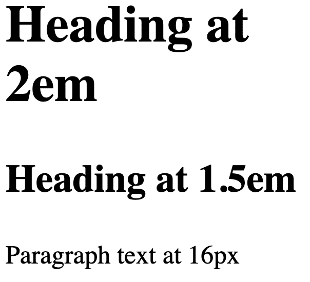
Here’s how the text would look like on a webpage.

But when this is viewed from a mobile phone with larger text size configurations, it adjusts accordingly.

Maintaining Aspect Ratios
When dealing with media content like images and videos, it’s often important to maintain aspect rations. Using percentages for widths and auto for heights can help maintain the aspect ratios regardless of the screen size.
Below is an example of the img selector with width set to 50%:
img {
   max-width: 50%;
   height: auto;
   float: right;
}
Now when you display this on a webpage it should look like this:

When viewed on a mobile or tablet device, it still just follows that it will only occupy 50% of the space and should look like this:

There are so many things that you need to take account of in choosing the right CSS unit, so which one should be used?
There is actually no right or wrong answer. There is also no one answer. It all depends on the needs you are prioritizing for the website you’re building. You can actually mix the CSS units to cater to your website’s needs. To help you, here’s a guide on what CSS units for the different elements of a website:
Typography
For typography, using relative units like ‘em’ or ‘rem’ is recommended. This ensures that the text scales well on different devices. ‘Rem’ is especially useful for consistent scaling, as it’s always relative to the base font size.
Layout and Spacing
For layout and spacing, a combination of units can be effective.
- Use ‘percentage’ for fluid grids where elements should adjust according to the parent container.
- Use ‘viewport units’ for sections that should scale based on the viewport size.
- Use ‘pixels’ for fixed dimensions, where scaling is not desired. Scalable Elements
For scalable elements like icons or responsive images, using ‘em’ or ‘rem’ can be effective. This ensures that these elements scale in proportion to the text.
Media Queries
For media queries, it’s often best to use ‘em’ units. This is because they are based on the font-size, and can adapt if the user has custom browser settings for font size.
Conclusion
The selection of CSS units is a fundamental aspect of web design that can greatly influence the responsiveness and accessibility of a website. While there is no one-size-fits-all approach, understanding the differences between these units is essential in making informed decisions that best suit the design goals and user experience. As a rule of thumb, lean towards relative units for a more scalable and responsive design, while employing absolute units for precise control where necessary.
