
Stackable is the ultimate toolkit that turns the WordPress Block Editor (Gutenberg) into a page builder. It’s packed with a lot of features and design options that make designing professional websites much easier. In our latest release, we’ve added a new feature that gives users the ability to create complex layouts without the hassle — Flexbox. This feature enables designers to create responsive layouts with ease. This article will walk you through the new Flexbox controls in Stackable.
What is Flexbox?
Flexbox, short for the Flexible Box Layout Module, is a CSS3 web layout model. It’s used for the arrangement, alignment, and distribution of space among items in a container. Flexbox is widely used due to its ability to create simplified layouts and it’s especially useful in making layout designs responsive.
Flexbox in CSS usually looks like this:
.flex-container {
    display: flex;
    flex-direction: row;
    justify-content: space-between;
    align-items: center;
    padding: 10px;
    border: 1px solid #ccc;
    background-color: #f0f0f0;
}

.flex-item {
    flex: 1;
    padding: 10px;
    margin: 5px;
    text-align: center;
    border: 1px solid #ccc;
    background-color: #fff;
}
Flexbox in Stackable
The WordPress Block Editor has very limited options for the arrangement of blocks. With Stackable and the addition of flexbox controls, users can now take advantage of this layout module without writing a single line of code.
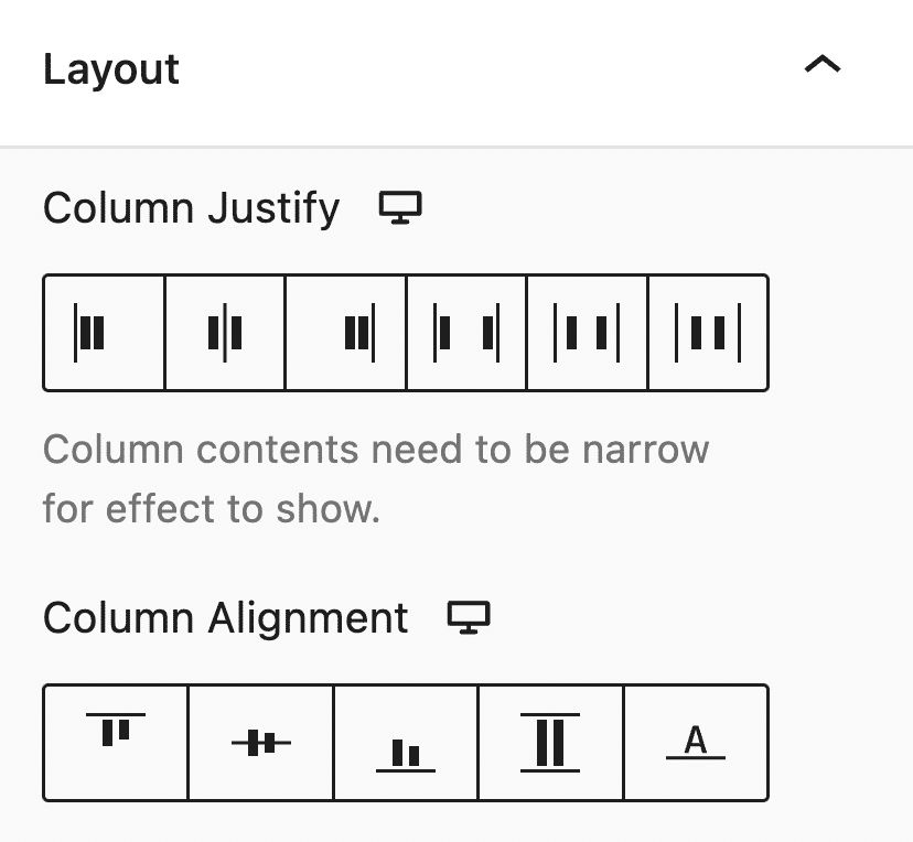
Stackable’s flexbox controls will be found in the Layout tab of the Inspector and it’s available for most blocks, mainly the Columns block and the Inner Columns block. Here are the controls to create flexible box layouts with Stackable:
Column Justify: This property sets the horizontal position and spacing of the inner columns.
Column Alignment: This property sets the vertical position of the inner columns relative to the columns block.
Content Vertical Align: This property sets the placement of the column container to top, center or bottom. Available when the min. block height is set to higher than default.
Inner Block Justify: This property sets the horizontal position and spacing of the inner columns.
Inner Block Alignment: This property sets the vertical position of the inner columns relative to the columns block.
Why Use Flexbox in Stackable?
Flexbox provides a more efficient method of creating layouts. Its dynamic nature makes it perfect for creating designs that adjust responsively, which is essential in this day and age. With Stackable’s user-friendly interface, you can make the most out of flexbox without having to write any code.
Significantly enhance your designs and create layouts that are not just visually appealing but also responsive. Whether you are a beginner, web designer or an experienced developer, Stackable’s flexbox is a feature that definitely upgrades your web design toolkit!