
One of the most effective tools for organizing content and enhancing user experience in web design is using tabs.
Tabs provide a user-friendly way to present information while saving screen space. In this article, we will delve into the world of tabs, explore their benefits, showcase various use cases, discuss best practices, and even provide a step-by-step guide to creating tabs for a WordPress website.
When should you use Tabs in web design?
Tabs are a valuable design element, but they are not always the best choice for every situation. Using tabs ineffectively can easily ruin the experience on your website. That’s why it’s essential to consider the specific context and objectives of your website when deciding whether to use tabs. Here are some factors to consider when deciding to use tabs:
- Content Organization: If you have related content that can be neatly divided into categories, tabs can be useful. They allow users to quickly switch between related sets of information without scrolling or navigating to another page.
- Volume of Content: Tabs are especially helpful when there’s a large amount of information that can be grouped into separate sections. If the content for each tab is minimal, it might not justify the use of tabs.
- Navigation Simplification: For websites with straightforward structures, like personal blogs or portfolio sites, tabs can serve as the primary navigation menu. Each tab corresponds to a key section of the site, making it easy for visitors to find what they’re looking for.
- Limited Screen Space: Tabs shine in responsive web design, where space is limited, and you want to optimize the use of available screen real estate. Tabs allow you to hide content behind tabs until users choose to access it, ensuring a clean and uncluttered interface.
Types of Tabs
Pricing Tab
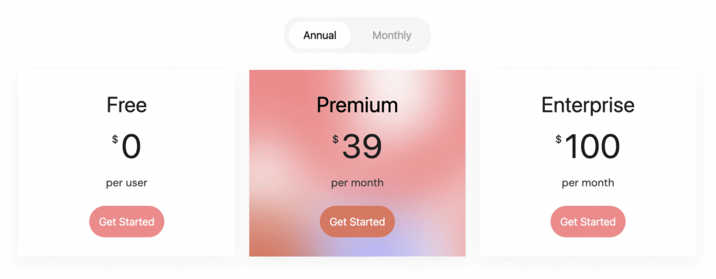
Businesses offering various plans or packages can effectively utilize pricing tabs to display the features and costs associated with each option. This layout empowers users to compare offerings and make informed decisions.
Category Tabs
E-commerce websites often implement category tabs to simplify the browsing process. Users can effortlessly switch between product categories, enhancing their shopping experience.
Product Info Tabs
When presenting detailed information about a product or service, using tabs for sections like “Overview,” “Features,” “Specifications,” and “Reviews” helps users quickly access the information most relevant to them.
Navigation Tabs
Navigation tabs act as a gateway to different sections of a website. They are commonly used for sections such as “Home,” “About Us,” “Services,” and “Contact,” ensuring easy access to vital content.
Best Practices for Using Tabs
Keep Labels Short and Clear
Tab labels should be concise and descriptive. Users should be able to understand the content behind each tab without confusion.
Highlight the Active Tab
Visual cues like changing the tab’s color or applying a border can help users easily identify which tab is currently active.
Quick Tab-switching
Ensure that tab-switching is smooth and seamless. Users should be able to switch between tabs without any lag or delay.
Use Consistent Styling
Maintain a consistent design style throughout your tabs. This fosters a cohesive look and feel, contributing to a more polished user experience.
Ensure Accessibility
Tabs should be accessible to all users, including those with disabilities. Proper coding and adherence to accessibility guidelines are crucial.
Keep Tab Labels in a Single Row
If possible, keep all tab labels in a single row to prevent overcrowding and confusion. Consider alternative designs if space becomes an issue.
How To Create Tabs for a WordPress Website
Creating tabs for a WordPress website isn’t as complicated as you might think. One method you can consider is to use Stackable, a free plugin that offers the Tabs block and intuitive design controls for customizing the Tabs block’s appearance. We’ll teach you how to recreate the tabs in this example:
1. Install and activate the Stackable plugin
From your WordPress dashboard, navigate to Plugins > Add New. Search for Stackable in the search bar and it should show up as the first result. Click the Install button and then click Activate.
2. Create or open a page/post and add the Tabs block
You can add the Tabs block from the Inserter. Just type in “Tabs” and it should appear. From here, we can start setting up the Tabs block.
First, let’s change the tab number to 2, since we will only need two tabs for this example. Then let’s adjust the block width to Align Full, and the content width to Align Wide.
Next, we’ll start customizing the Tab labels. Select the Tab labels, and in the Style tab, select the Centered Pills option. Then we’ll customize the button colors. For button color, we’re selecting Transparent, and for text color, we’ll select a dark gray. Click the Hover State button and change it to “Hovered State”.
Third, let’s navigate to the Tab Active State panel, change back the hover state to “Normal State”, and select the teal color for the button color and black for the text color.
Finally, let’s just input the names of the tab labels. For the first one, it’s “Monthly” and for the second tab, it’s “Yearly”.
3. Customize the tabs’ content
Now we’ll add our content. Let’s go to the Monthly tab and add the Columns block, select the one column layout. First, add the Image block. Navigate to Style > Borders & Shadows, and change the Border Radius to 8.
Next, let’s add the Price block – for this example, we’ll change it to “$69 / month”. Then we added the Text block and added the text “Up to 1 single user. Perfect plan for freelancers and individual contributors.” Next, we also added a Divider and the Icon List block to display what this pricing tier includes.
Lastly, let’s add the Button block. We named the button “Get Started” and headed to Style > Button Colors to change its color to black, and the text color to white. Next, we opened up the Button Size & Spacing panel and turned on the Full Width toggle; then, opening up the Button Borders & Shadows panel, we adjusted the border radius to 8.
As a last minute addition, we selected the Icon List and set it to a different check icon. We also change the icon size to 2 to enlarge it.
4. Adjust styling, colors, and other design elements using Stackable’s settings.
First, select the Inner Column containing our content. Navigate to Style > Borders & Shadows and select the solid border. We’ll select a gray color for this and set the border radius to 16. Let’s see how that looks.
Now that we’re done with the border colors, let’s start duplicating this column for the rest of the pricing tiers. Selecting the Column block, we’ll go to Layout Tab > Layout panel and setting the columns to 3. Doing this will multiply our columns and copy the contents of the first inner column. Next, we set the Column Gap to 10 to add space between the columns.
Finally, here, we’re just changing the content of each column accordingly. The middle one is Advanced, while the third column is Professional. We want to put emphasis on a tier that we will recommend so let’s make some additional adjustments to the design of this column. Selecting the third inner column, we navigated to Style > Borders & Shadows. We selected the purple color for the border color. Then, selecting the Button block, we also selected purple for its color.
5. Adding the content to the second tab
This part is fairly easy. Since we just need the same Columns block in the second tab, we’ll just copy the Columns block. To do this, go to the List View and select the Columns block. Click the Settings button (︙) to its right and click Copy. Click on the second tab (Yearly) and paste it by pressing Command/Control + V.
Now, all we have to do is change the pricing for each tier, since this is for the yearly pricing scheme.
Don’t forget to hit Save to save all your changes.
6. Preview your tabs in action
Now we’re done with building this pricing table, all that’s left to do is check how it looks in the frontend!
Now we’ve built a pricing table with two pricing schemes, each with three different tiers.
Conclusion
In the realm of web design, tabs stand as a versatile and powerful tool for organizing content, optimizing space, improving navigation, and enhancing user experiences. By implementing best practices and utilizing the right tools, designers can create seamless and engaging tabbed interfaces that captivate users and simplify their online interactions. Whether you’re building an e-commerce platform, a blog, or a corporate website, incorporating well-designed tabs can truly elevate your web design game.
Thanks for sharing with us about how to use tabs in web design when to use and best practices.
Glad to help!