BASICS OF V3
Basics of V2 Controls vs. V3 Controls
Learn everything you need to know about Stackable’s biggest update yet. This video will show you everything that’s new in Stackable, and the differences in how you style blocks in Version 2 and in Version 3.
Stackable version 3 came with big changes in your workflow and a lot of new features. This tutorial will show you everything that’s new in version 3, and will touch on the differences in how you style blocks in v2 and in v3.
So what’s the biggest change in Stackable version 3?
V3 Block categories
The biggest change would be the fact that version 3 replaces the old version 2 blocks and are now categorized into three types:
Essential blocks
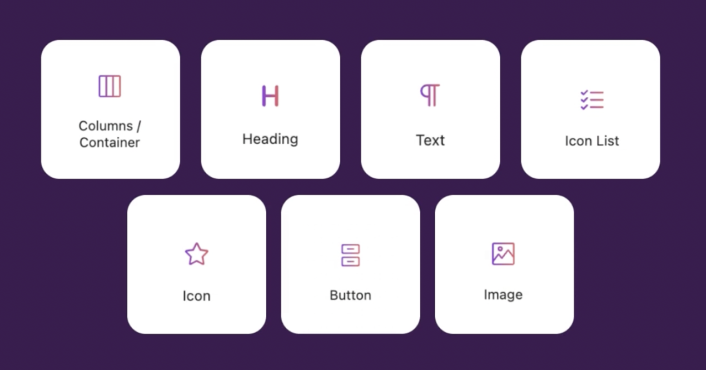
The Essential blocks are all the basic blocks that you need to build your website. So these would be the Columns, Heading, Text, Image, Icon List and Icon blocks. You can already create virtually any layout and any design by using only the Essential blocks.
Special blocks

The Special blocks are blocks that have special functionalities. These blocks include the Accordion block, Count Up block, Card block, Posts block, Video Popup block, Design Library, and more. Basically, these blocks allow you to create distinctive designs that you cannot achieve with our Essential blocks alone.
Section blocks
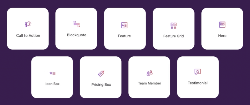
Section blocks Finally, the Section blocks are combinations of essential and special blocks that you can use to quickly build pages. This includes the Feature block, Blockquote block, Hero block, Pricing Box block, and more.
These new blocks are meant to replace the old version 2 blocks. They work differently from before, but in a good way.
How Are V3 Blocks Different From V2 Blocks
In version 2, each block was designed as single large blocks. For example, the Feature block already has a built-in heading, description and button. It had its benefits, but a major flaw of this set up is how limiting it is.
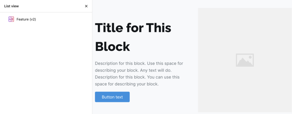
In version 3, things work a little differently. Now everything is a block, meaning that the blocks are now composed of multiple smaller blocks. So for the Feature block, it will contain Columns, a Heading, Text, Image, and Button block.

With this new block structure, you are given more flexibility and control in the way you build and design your blocks. You can now nest any block inside other blocks and rearrange them to your liking. These weren’t possible in version 2.
More things that weren’t possible in v2 but are now possible in v3 are:
- You now have the ability to add more than 6 columns
- You can now adjust each column and their contents individually
- You can now customize or rearrange the designs of your blocks
Building with v3 blocks (v2 vs. v3)
This may be where things can get confusing, but trust that the new way of building in v3 is one big step forward.
We’ve discussed earlier in the video that now in version 3, almost everything is now composed of a block. Adding blocks is the same as before, but now you can nest blocks as well.
The workflow in editing a block has slightly changed from v2. In this part of the video, we will enumerates the differences in how you style blocks in version 2 and version 3.
Styling the title of a block
In v2, if you want to style the title of a block, you will see the “Title” panel in the inspector which you will need to open in order to edit the title’s options.
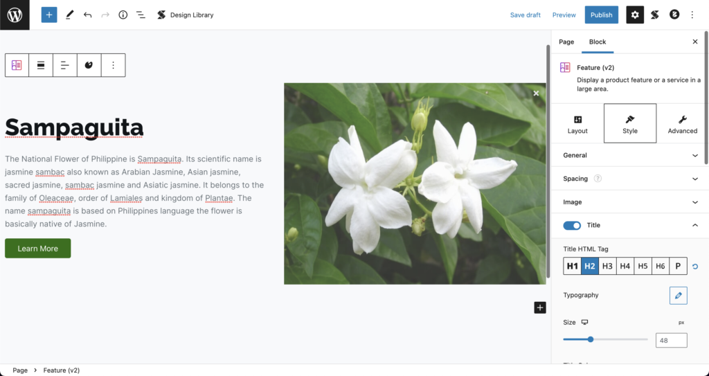
Now in v3, since the title is already its own separate block, you will need to click on the title block, which in this case is the Heading block. Clicking on it will open the inspector where you can make your adjustments.
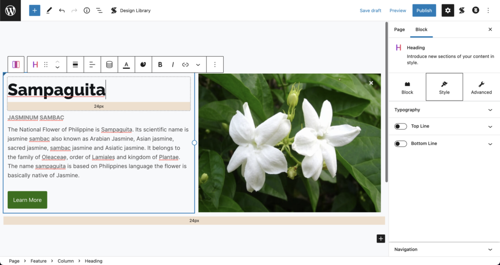
You will notice that once you click on the block, you’ll see on the top of the inspector that the block is now a “Heading block”.
Removing or adding the title of a block
In v2, to remove this title, you will need to select the block, then look for the corresponding option to toggle on/off the “Title” setting in the inspector.

In v3, you will need to click on the block, then delete it by clicking on the 3-dot button, and then “Remove block”. To add a block, you just click on the black + sign button and add the block you want.
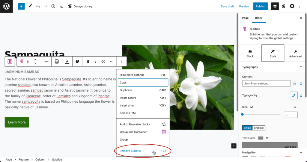
Note that the same steps apply for other nested blocks.
Adding something that’s not included in the block.
For example, you want to use a bullet list instead of text inside the Feature block.
In v2, this is not possible because v2 blocks are self-contained, meaning that the things you see in the block are fixed and cannot be changed.
In v3, this is possible and you can do it by just simply adding a new block.
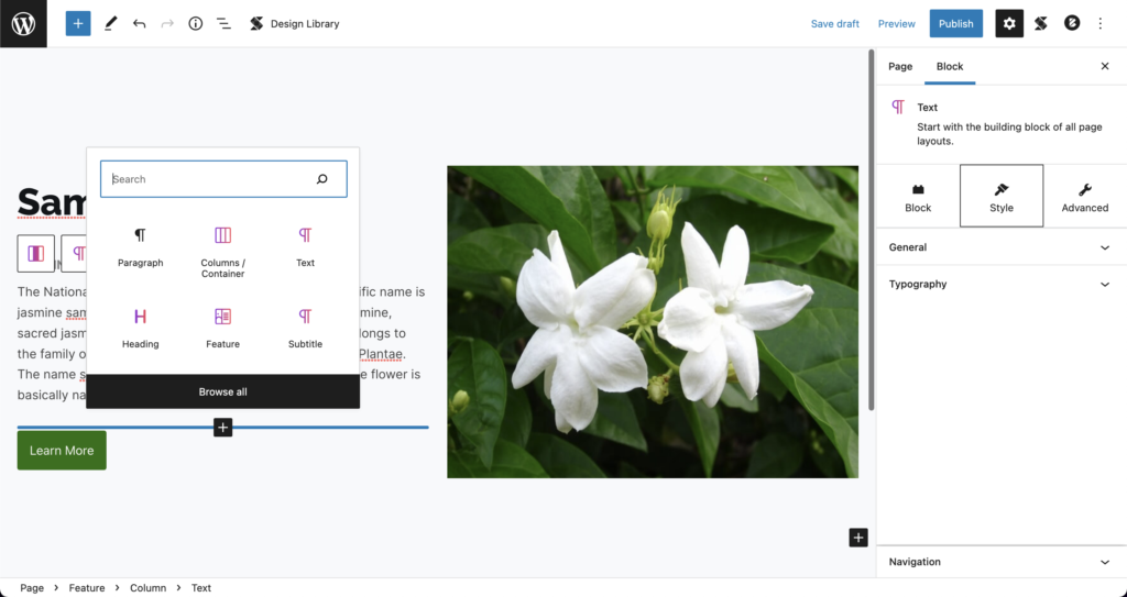
Rearrange the content
In v2, this is also not possible because of the same reason of it being self-contained.

In v3, this is possible by just moving the blocks up or down. You can do this in the block’s toolbar where you will see the arrows.
Adding more columns of a block
In v2, you slide the columns option under the Style tab in the inspector (for blocks that support it)
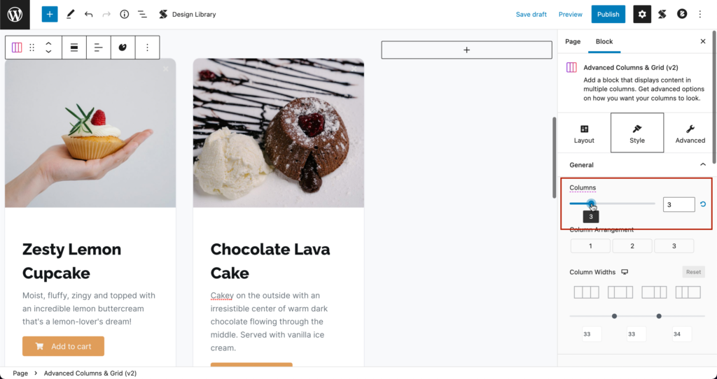
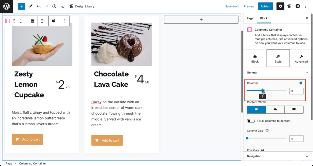
In v3, you add the block in a Columns block, and slide the columns option in the Style tab of the inspector or you can also type in a number in the field.
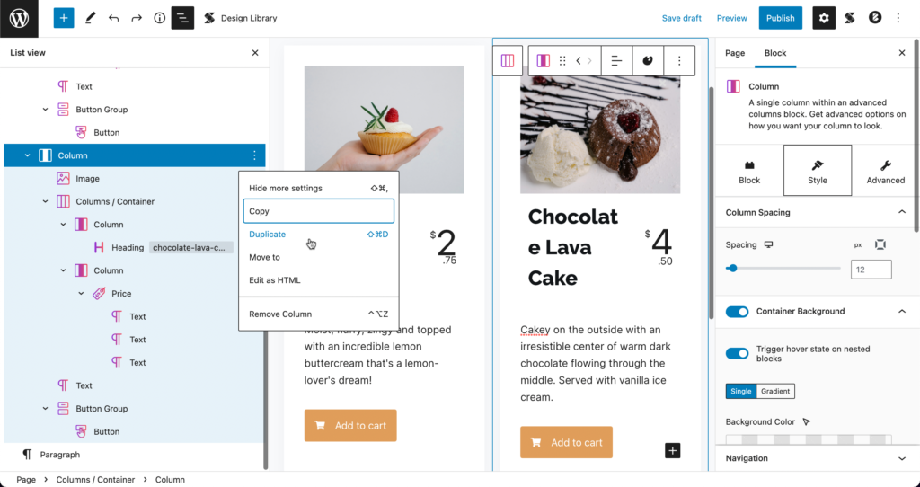
You could also duplicate the column.
Styling multiple columns simultaneously
In v2, if you design one column, all options get applied across all the other columns of that block.
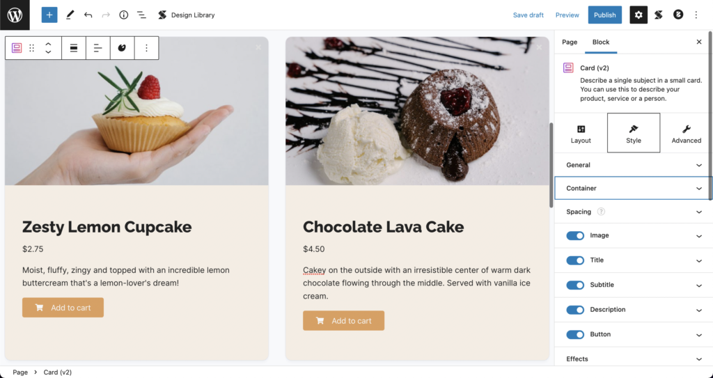
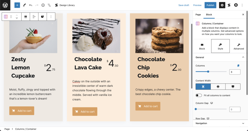
In v3, you can duplicate the block, use the copy and paste styles button in the toolbar, or enable block linking on the top right corner of the Column block when styling (block linking is a beta feature that you need to enable)
Rearranging columns
In v2 , you should click and drag the column changer option under the Style tab in the inspector
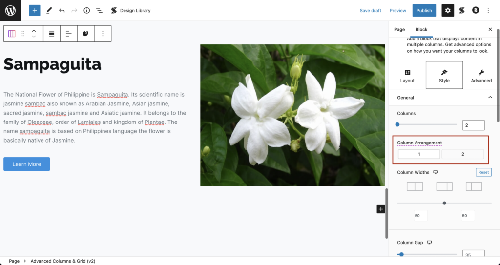
In v3, you just move the column block left or right using the arrows in the toolbar
Picking layouts
In v2, go to the Layout tab and choose a layout
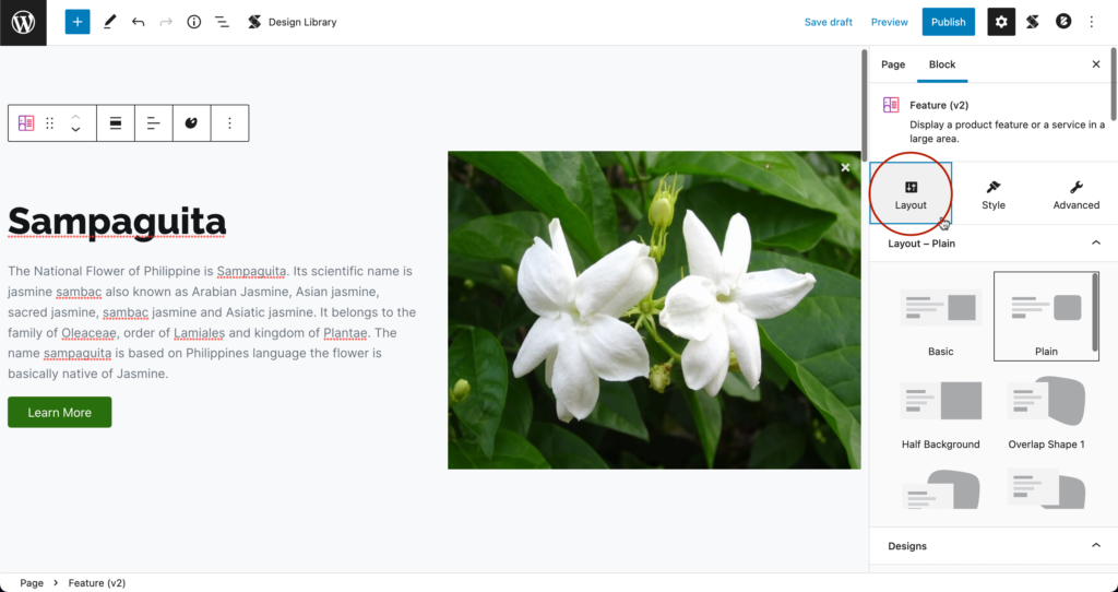
In v3, when you add a block, a layout picker will popup where you can choose your layout before adding the block.
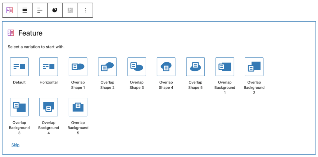
And when you want to switch the layout you’ve chosen, just click on the Reset Layout button in the toolbar and the layout picker will appear again.

New Inspector
There are three tabs where you can edit Stackable blocks in the Inspector: Block, Style, and Advanced.
The Block tab is where you can edit the Alignment, Background settings, Size & Spacing, Borders & Shadows, and in some blocks, such as the Columns / Container, Hero, Feature Grid, Feature, Call to Action blocks, you can add a Top Separator and/or a Bottom Separator.
The Style tab is where you can find the various design options available for the block you’re using. This is where you will find typography settings for Heading, Text, or blocks that use text; image settings for Image, Image Box, or any block that uses images, and more.
Finally, the Advanced tab is where will find more advanced design options such as
- Motion Effects and Transform & Transition so you can add website animations
- Conditional Display, Custom Attributes, and Custom CSS so you can give your visitors a personalized experience on your website
- Responsiveness for mobile and tablet display optimization
- and more!
Additionally, here are some highlights to the new Inspector
- In range slider controls, you can now type in values which are past the slider minimum and maximum values. For example, the range of the border radius slider is from 0px to 50px, but in the text field, you can type in 100px so you can have more control over its value.
- Most inspector options now have a reset button so that you can reset the design options to default.
- Some inspector options have hover toggle buttons, toggling the hover button will allow you to style what blocks look like when they’re hovered on. We will have another video later on that gives a deeper dive into the Hover States and what you can achieve with it.
Conclusion
This is a big step for Stackable, but it is a big step forward. This is the new way of building with v3, giving you a more fine tuned experience as you build with Gutenberg
PREVIOUSLY IN BASICS OF V3
How to Migrate from V2 to V3
Kickstart your page building journey with Stackable Version 3. This video will help guide you easily migrate to Stackable Version 3 coming from Version 2.
NEXT IN BASICS OF V3
Building with Stackable Version 3
In this video, we go through the process of building a website using the WordPress block editor, Gutenberg – selecting a theme, building and designing pages, optimizing a website for responsiveness, and more.