In this version update, you will start to feel the shift in how efficiently you can use Stackable. Update to version 3.16.0 to enjoy block theme / theme.json support, presets in slider controls, global value presets and typography type scale.
In our article about our roadmap and our direction, we mentioned that we are positioning Stackable to be the essential companion for the Block Editor for building complete sites. In order to get there, we are slowly rolling out some key features that will let you globally style multiple blocks and multiple pages.
Here’s a rundown of what’s new for you in Stackable v3.16.0.
New: Theme.json Support
Previously, when you add a Stackable block.. for example, a Stackable button block.. it would have a different look as a native one. Take a look here, for this I’m using the default Twenty Twenty Five theme:

One would think that this a small thing, and would be normally okay.. but after some thinking, we believe this isn’t so good. It would mean that Stackable (button) blocks would always look alien to your current website. From an efficiency standpoint, to just make Stackable blocks fit, you would always have to style them just in order.
Now you won’t have to do this. Starting now, Stackable will better inherit styles from your block theme. When you add a Stackable button block, it should look the same as a native button block.. Stackable and native headings will look the same.. blocks that have native counterparts would look the same.

Sounds simple enough, but it actually unlocks a new type of workflow: whenever you just need a simple button, then you’re free to use a native button block; but if you need more advanced options (like you need an icon for example, or you want a special hover effect), then you can just swap the button out for a more advanced Stackable button.
Another benefit of having this is it removes a layer of inefficiency – you no longer have to style Stackable blocks to match your block theme, they would just fit in right away.
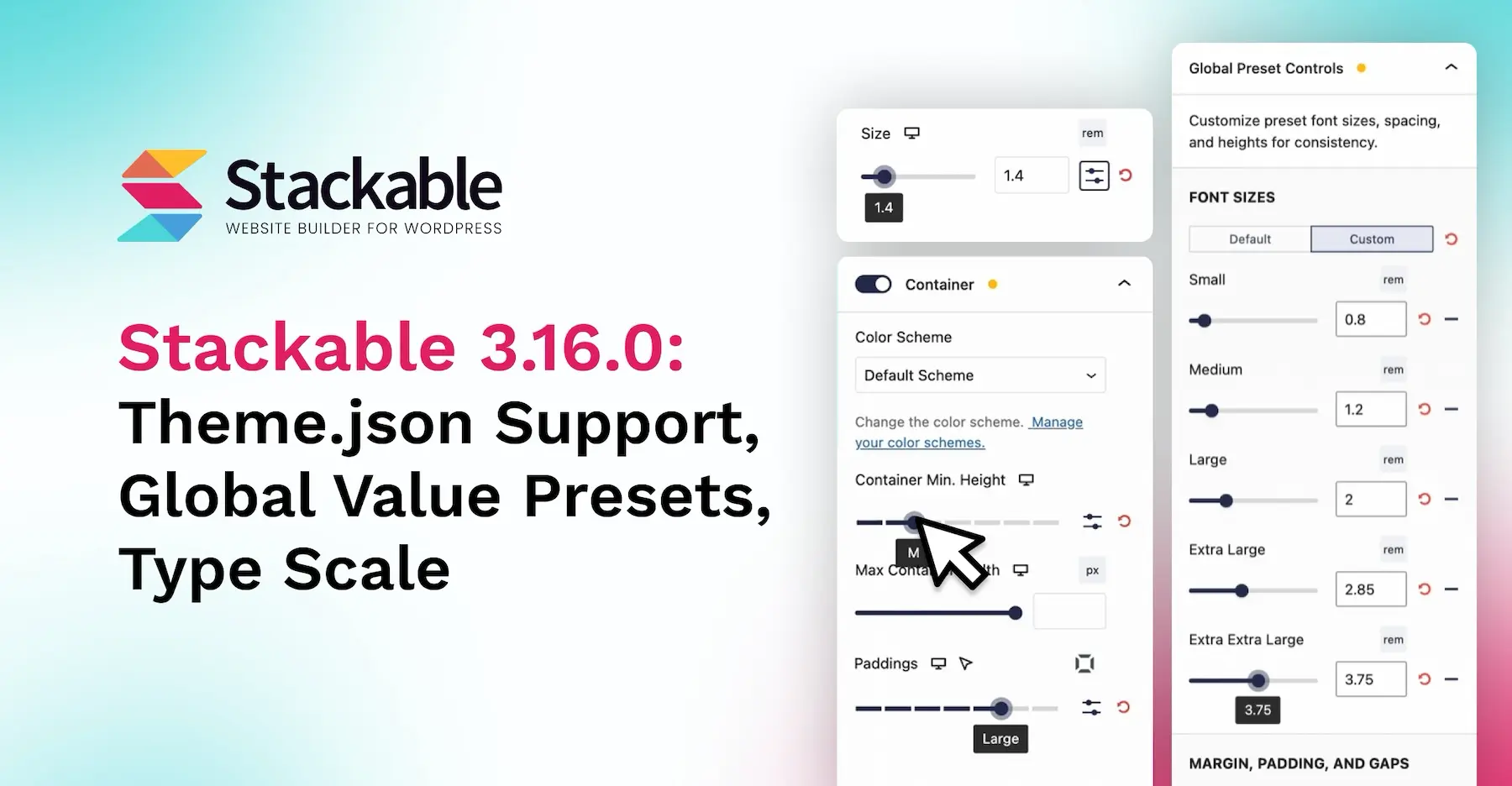
New: Preset Sliders & Global Value Presets
Global Value Presets is also brought upon by our new theme.json support, but this deserves a special heading of its own.
In block themes and in theme.json, you can set preset values for colors, font sizes, spacing, margins, etc. This is part of what makes block themes great.
Now when you have preset values defined in your block theme, Stackable can use those values in different ways. For example, if you have preset color values defined in your block theme, these colors would also appear in Stackable’s color pickers (Stackable already does this prior to this new version).
Starting now however, font sizes and spacings will now also be supported by Stackable. Sizes and spacings defined in your block theme will now appear in various slider controls. Now you will be able to slide between different preset values like small, medium, large, extra large, or extra extra large for font sizes, gaps, margins, paddings and more.
Slider controls will now also have a preset/custom mode switcher that you can use to toggle between sliding between presets, or for absolute values if you need extra precision.
A few block attributes will have these preset sliders, to name a few:
- Font size
- Margins
- Paddings
- Border radius
- Column gaps
- Row gaps
- Inner column spacing
- Minimum column height
- Inner block gaps
- any more
If you need non-preset values, you can always toggle custom mode and use an arbitrary value.
Continuing with the ability of swapping between Stackable and native blocks, these preset values allow you to easily assign the same sizes for Stackable and native blocks! As an added bonus, if preset values in block theme that uses fluid typography will also apply them to Stackable blocks.
For Premium users, you will be able to change the definitions of these Global Preset Values, allowing you to customize and fine tune your presets across your entire site.
New: Global Typography Type Scale
Lastly, we’ve added the ability to assign a Type Scale for your Global Typography.
If you’re not familiar with what Type Scale is, check this site out called Typescale.com – basically it’s an elegant way to define a “scale” across your H1 to H6, body text and smaller. This ensures that the hierarchy of your typography looks pleasant to the eye.
In your Stackable Global Typography settings, you’ll now see a Type Scale drop down. To use it, simply pick a ratio, then all your headings and other text would change their font sizes appropriately.
This also works well in responsive mode. You can set different Type Scales for tablet and mobile views. This new option gives you a quick way to make your headings fit well in smaller screens.
Backward Compatibility
Backward compatibility is very important to us. If you’re updating from a lower version to 3.16.0, the Theme.json Support and Value Presets features would be disabled by default. This is how we gracefully implement changes in Stackable.
We do this so that nothing would change in your existing website, and Stackable would work (almost) the way it would as before you updated.
If you want to enable these new features, then you can head over to the Stackable settings. For new installs of Stackable, these options would be enabled by default.
For those updating, to enable Theme.json Support, tick Miscellaneous > Inherit Block Style from theme.json

To enable Value Presets in sliders, tick Editor Settings > Editor > Use Size Presets by Default.

Don’t forget to save your changes.
Conclusion
This update is a pivotal moment for Stackable.
Our goal is that with these new updates, you will only need to tinker around with individual blocks if you’re building something “one-off”. What we envision is that simply adding Stackable blocks would always fit your website, allowing you to build websites and pages more efficiently.