At Stackable, we’re always thinking about how we can make our plugin better for our users. For the past few months, we’ve been developing a new user interface that will revolutionize how users design with the WordPress Block Editor. This unlocks a lot of capabilities and design opportunities when it comes to creating layouts.
On March 29, 2023, we opened up a beta program for Stackable users to test the new UI. 60 people signed up for the beta and we received a lot of valuable feedback and suggestions. Now, we’re excited to introduce the new and improved Stackable UI!
About this Update
The new UI is released with Stackable version 3.8.0. Throughout the development process of the new UI, we’ve made sure that all blocks in published pages and websites will be able to transition to the new user interface. It is fully backwards compatible, and will not affect the design of old pages and websites in any way.
To easily transition to the new Stackable UI, you can watch this short video to quickly learn about all the changes that come with this new user interface:
Why change the UI?
We realize that this is a big change and it hasn’t even been that long since the jump from Stackable V2 to V3 but we wanted to change the Stackable UI for three reasons:
Better Quality of Life
We’ve made creating layouts easier with a more efficient workflow and more intuitive interface. The new UI was designed to lessen the jumping between tabs and panels in the inspector. We’ve also added some visual guides for layouts options so you can easily see how your adjustments such as margin and padding value changes affect your block. We’ll explain these in more detail later on!
Additional Controls
This release includes several new features and improvements to existing functionality. The additional controls will give our users the ability to easily create complex layouts without having to jump through hoops.
Better Organization of Controls
We’ve changed the tabs in the inspector and made it more organized. We’ve also improved the panels to make the Inspector simpler to navigate through and more user-friendly. For example, layout controls which you would most likely use for wireframing or building layouts are in its own tab, and style controls which you use to stylize blocks will be in another.
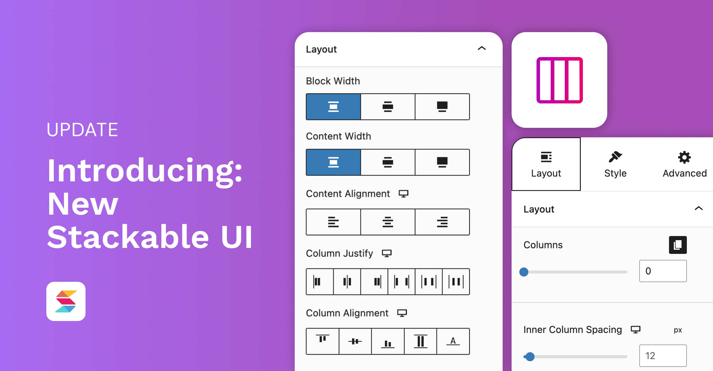
What’s New with Stackable’s UI?
The new Stackable UI promises to be a major improvement over the previous version and here are all the new changes that come with it:
Inspector
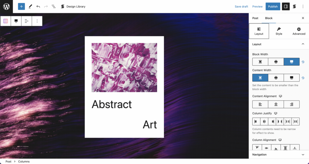
New Inspector Organization
Control panels used to be scattered among the old tabs of the Stackable Inspector. Now, we’ve categorized controls into three main purposes: Layout, Style, and Advanced. Now, all controls that are used for customizing block layouts are in the Layout tab, all controls used to stylize blocks are in the Style tab, and all complex controls will be in the Advanced tab.
As an example, here’s the Inspector for an Inner Column block. The Container panel will now be in the Layout tab. When turned on, Container styling panels will be available in the Style tab.
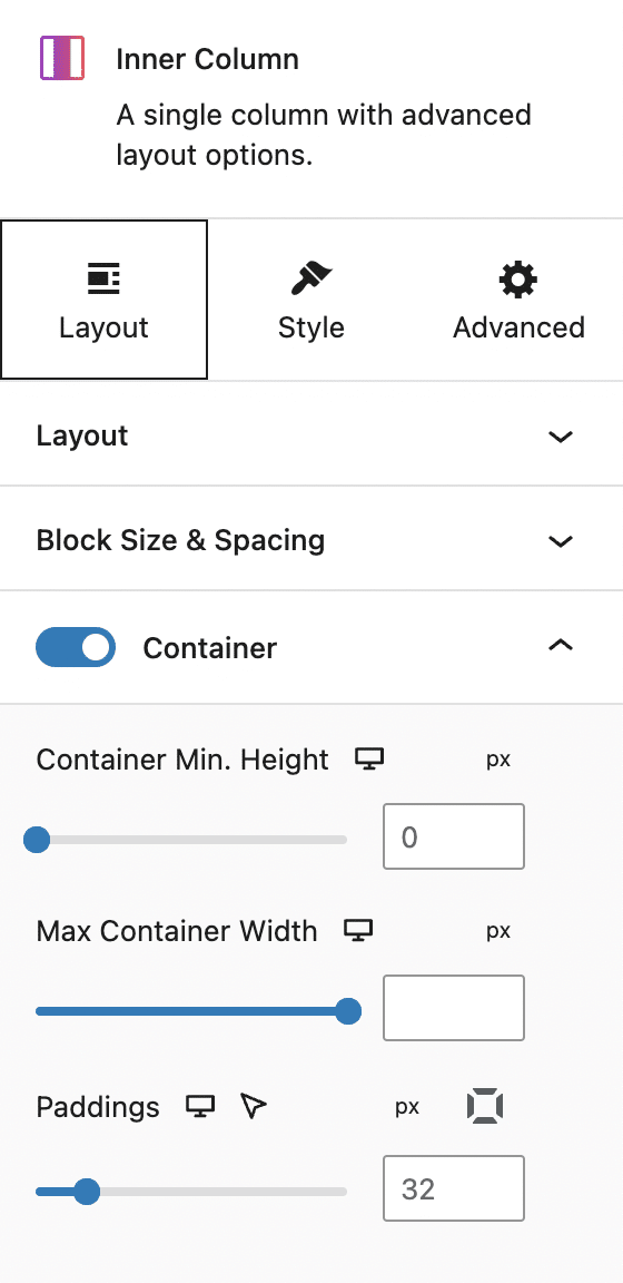
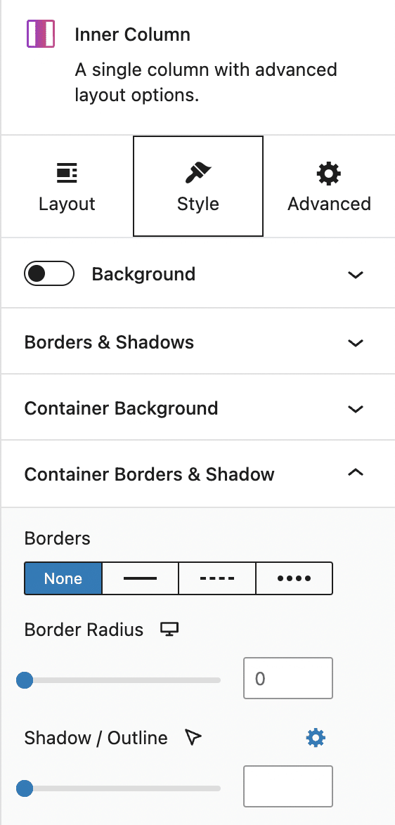
This change really makes it easier to locate different control panels and making designers’ workflows easier to create complex layouts.
Opens Most Relevant Panel
Adding a block will open the most relevant panel to design it. For example, if you add any text block (e.g. Heading, Text), it will open up the Typography panel in the Style tab. Or if you add an image block, it will open up the Image panel.
Additionally, when you’re in the process of designing a whole page and you’re going back between different blocks, it opens up the last opened panel.
Users can now easily access to panels they have recently interacted with, without having to navigate through the inspector. Ultimately, even though these were minimal added features, we thought it can save users time and effort, and make the overall user experience more efficient.
Controls
Moving forward, we’ve made a lot of enhancements to Stackable controls to make designing hassle-free and uncomplicated. In the old UI, there were a lot of settings and options that were not so apparent. With that in mind, our development team created solutions that would make the capabilities of our controls easy enough to understand, even for beginners.
Content Width
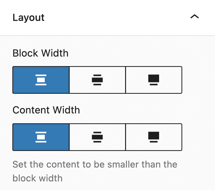
We’ve had the Content Width control before but what it did wasn’t obvious before, so we brought in the block width option near it. The main use of the Content Width option is to change the width of the content inside a block, so you can have the block occupy the full width, but limit the content to only the middle. Just like this:
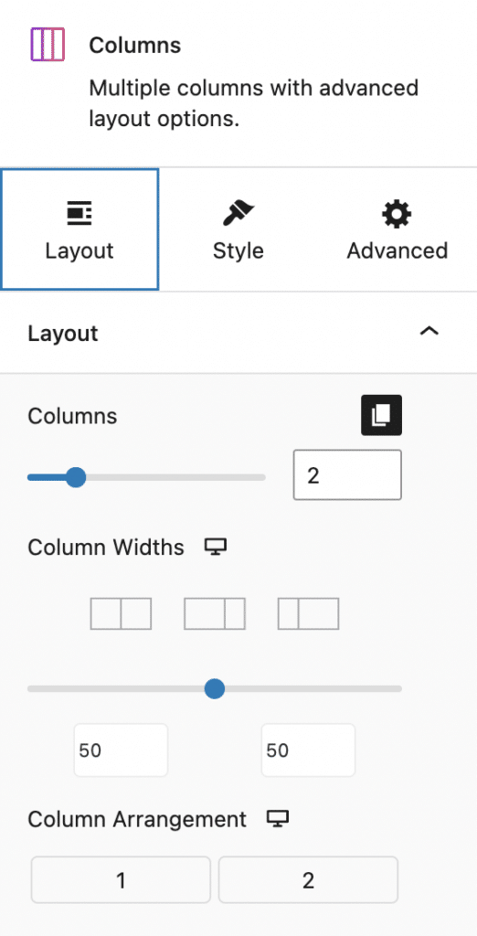
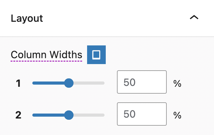
Better Column Width Adjustment Controls
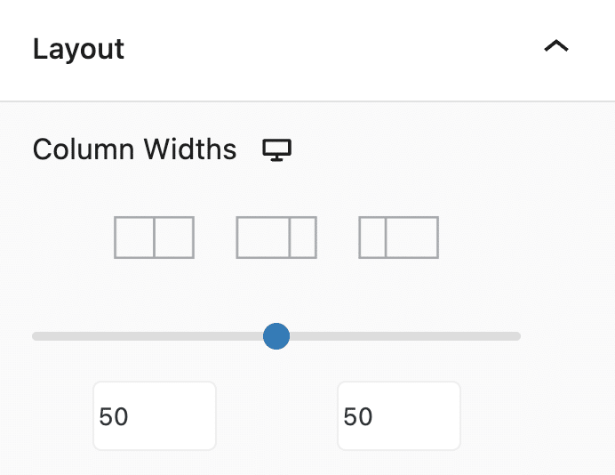
Aside from dragging the sides of your columns, there’s now a new inspector control to adjust column widths.
The context for this change was that it wasn’t so obvious before that you have control over how your columns collapsed and have different column widths for tablet and mobile views. Now if you go into tablet or mobile views, the control will change into multiple sliders so you can adjust each column width individually like in the photo below, making it easier to create responsive pages and websites:
Flexbox Controls
Previously, we had a “Fit all columns to content” toggle which was a partial implementation of flexbox. You won’t find this option anymore as this has been replaced by the new Flexbox controls, such as the Column Justify and Column Alignment. This makes arranging blocks inside a column easier. The Flexbox controls will be found in the Layout panel of the Layout tab.
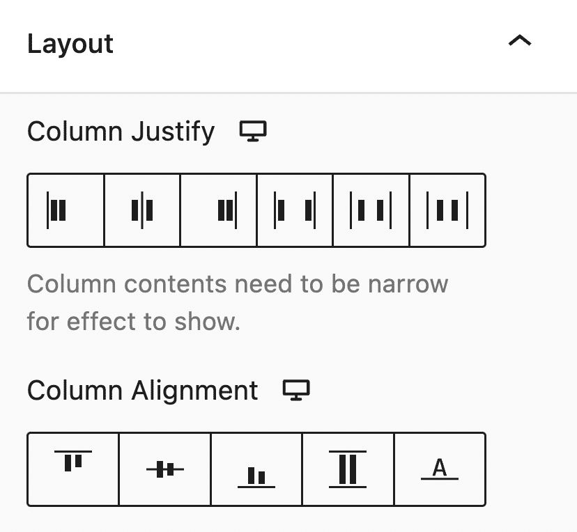
You also have additional flexbox controls for your vertical or horizontal inner blocks! This brings much more layout options at your fingertips.
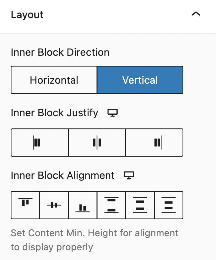
It’s now easy to create this type of layout:

The example above is just 1 column, with 2 blocks inside, the column’s Inner Block Direction is set to Horizontal, and Inner Block Justify to Space Between, and Inner Block Alignment to Center.
Align Last Block to Bottom
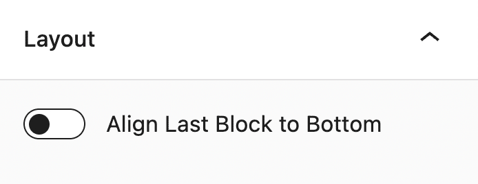
We get a lot of questions on how to create multi-column layouts where the last button is aligned to the bottom (think multiple pricing tiers or multi-column cards), now we have a dedicated button for this! Here’s how it looks like in the Block Editor:
Tablet and Mobile Column Arrangement
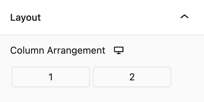
Rearranging column order for tablet and mobile is now a Free Feature, and will now be found inside the Layout tab > Layout panel. It’s now easily accessible, and is easy to use as well. You just have to drag the column number to fix the arrangement of your columns.
Inner Column Spacing Control
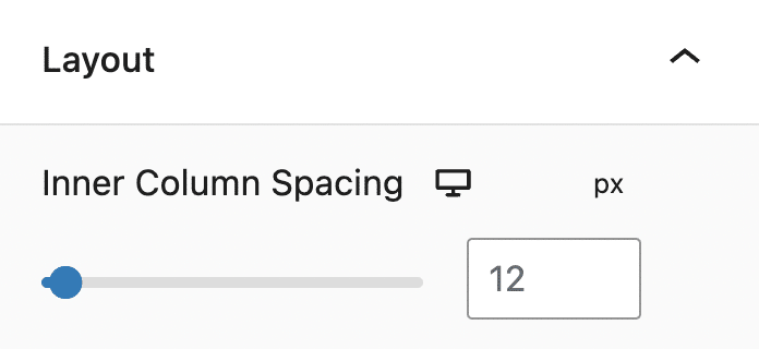
Moving on, there’s now a way to control all the column spacing of all Inner Columns in one single go. Before, you’d used to go to each Inner Column block and adjust their column spacing one by one.
Better Support for Margin Auto
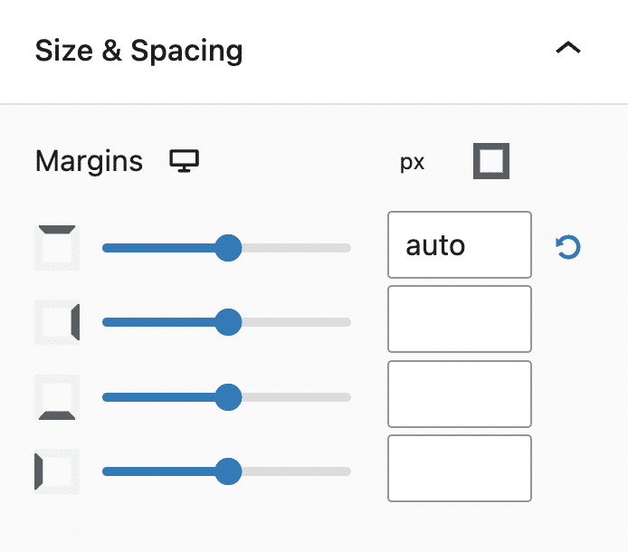
In CSS, when you use margin “auto” it usually results in the element pushing the other elements – and is very helpful if you want to build layouts where the last one sticks to the bottom, or to the side.
This didn’t really work well before and while the “auto” was applied in the frontend (sometimes), it didn’t appear well in the editor. Now we’ve added support for margin auto, so if you add it into a block that’s inside a column with other blocks, it should push the block correctly.
This also works for Button Groups!
Support for Floating Columns
It’s also now possible to float an Inner Column block (provided you set it to align to top).
Visual Guides
We’ve added a visual aid that helps users see how padding and margin values affect blocks. These appear every time you adjust the paddings and margins in a block.
Additionally, outlines appear every time you select justify or alignment options in our flexbox controls so users can see how the block changes.
Lightbox
Now you can display media, such as images, videos, and embeds in an overlay on top of a website through the Stackable Lightbox feature. This gives users the ability to have a closer look at a selected medium. This is applicable to columns, images, or even buttons.
Conclusion
We’re continuously improving Stackable and in this release, we’ve made it easier for you to create better layouts and be more efficient in building websites with the WordPress block editor.
We have a lot more in store for you so watch out for any updates on our end.
Update Stackable now and see these changes for yourself. Let us know how you like this brand new user interface in the comments below.
This is an awesome update!
How does this affect current layouts? Will there be an option to update to flexbox like in Elementor? I guess it will not break current designs.
Thanks Hans! Stackable v3.8.0 is fully backwards compatible so you won’t have to manually update existing layouts to have Stackable Flexbox controls. You are right—current designs will not break because the new controls will simply inherit the settings that your designs have.
Ahhhh, this was much needed guys, well done! I think you guys have made a HUGE improvement here.
We’re glad you liked the new UI, Nick!
Awesome update!
(btw this post absolutely lags my laptop. 100% CPU Utilization.)
Glad to hear you’re enjoying Stackable! I believe we’ve fixed this – thanks for letting us know!
These are great improvements!
My wishlist for the future would still be:
-allowing columns to wrap — it’s annoying to add rows and rows of like 3 columns each instead of having 6+ columns and letting them wrap to multiple rows. Like with Card blocks, if I want to have 5 I have to make a row of 3 and then a row of 2 underneath and moving the cards between rows to reorganize them is cumbersome.
-an actual slider block
-a tabbed content block
Hi Logan! A Carousel and Tabs block are actually on our roadmap and about wrapping columns we will see what we can do about this because more and more people are asking for this. We’re glad to hear you liked this update 🙌 Watch out for our next releases!
Hay un problema. Creo que es la actualización de Stackable que ha empezado a crear este problema, porque justo lo actualicé hace 1/2 días y ha empezado a salirme errores cuando creo una página con Gutenberg.
No entiendo de programación, pero lo comparto a ver si podéis ayudarme:
TypeError: Cannot convert undefined or null to object
at Function.entries ()
at Or (https://marketingvape.es/wp-includes/js/dist/block-editor.min.js?ver=43e40e04f77d598ede94:26:105918)
at https://marketingvape.es/wp-includes/js/dist/block-editor.min.js?ver=43e40e04f77d598ede94:26:105958
at Array.map ()
at Or (https://marketingvape.es/wp-includes/js/dist/block-editor.min.js?ver=43e40e04f77d598ede94:26:105929)
at https://marketingvape.es/wp-includes/js/dist/block-editor.min.js?ver=43e40e04f77d598ede94:26:105958
at Array.map ()
at Or (https://marketingvape.es/wp-includes/js/dist/block-editor.min.js?ver=43e40e04f77d598ede94:26:105929)
at Dr (https://marketingvape.es/wp-includes/js/dist/block-editor.min.js?ver=43e40e04f77d598ede94:26:106083)
at https://marketingvape.es/wp-includes/js/dist/block-editor.min.js?ver=43e40e04f77d598ede94:26:106604
Hi Daniele! Thanks for reaching out to us. Could you send us an email at support@wpstackable.com so we can get more details from you? Also, we are constantly releasing updates so please check whether the latest update fixes things.
Translation via Google:
¡Hola Danielle! Gracias por ponerte en contacto con nosotros. ¿Podría enviarnos un correo electrónico a support@wpstackable.com para que podamos obtener más detalles de usted? Además, lanzamos actualizaciones constantemente, así que verifique si la última actualización soluciona las cosas.
May I know how to float an Inner Column block? It seems I cannot find the settings.
By float, do you mean you want to make it sticky? You can do this by selecting an Inner Column block, then going to the Advanced Tab > Position Panel. There, you will find the Position drop down menu and select Sticky to make it float against the other columns – just make sure you have another column that’s tall so the floated Inner Column would have room to float in.
Dear Stackable Developers,
I wanted to extend my heartfelt kudos to all of you! You are truly an awesome team. 😎 I am incredibly grateful for the recent updates that have made website design a breeze. The improvements you’ve made to Stackable have made my life so much easier, and I appreciate the effort and skill that went into creating such a user-friendly experience.
Not only is the design aspect streamlined, but your team’s responsiveness and support have been outstanding. Whenever I had questions or needed assistance, you were there with prompt and helpful responses. It’s reassuring to know that I can rely on your team for assistance whenever I need it.
I also wanted to mention a new feature that another company recently launched—the loop query builder. It would be fantastic if Stackable could explore something similar. I have no doubt that your team’s innovative mindset and dedication to improvement will continue to bring exciting updates to the platform.
Lastly, I want to remind you all to take breaks and take care of yourselves. While your hard work is highly appreciated, it’s important to find balance and recharge. Remember to give yourselves well-deserved time off to relax and rejuvenate.
Once again, thank you so much to the entire Stackable team for your exceptional work. Keep being amazing and pushing the boundaries of website design!
Hi SendGadget! Thank you so much for your heartwarming message. It is truly gratifying to hear such kind words about our team and the work we do at Stackable. We always aim to provide our users with the best experience, and knowing that our efforts have made a significant difference to you is motivating.
Our support team, on the other hand, is thrilled to receive your acknowledgment. Their goal is to ensure our users feel supported at every step, and your message serves as a wonderful testament to their efforts.
We have been getting requests for a loop query builder and our dev team is looking into it. In the meantime, our blocks are actually fully compatible with the core Query Loop block. You can learn more about it by watching this video: https://www.youtube.com/watch?v=_xKx3kqYplw
Lastly, we appreciate your reminder to take care of ourselves and maintain a balance between life and work. Your feedback and kind words mean the world to us. Thank you for taking the time to share your thoughts and for your continued trust in Stackable. We remain committed to providing you with the best experience and look forward to continuing to exceed your expectations in the future.
Stay tuned for exciting updates and features on our platform!