Continuing our focus on efficiency, we’re excited to announce our completely new Design Library! We have replaced all designs with nearly 400 very usable layouts as well as added some styling options right inside the library. This is our most amazing update yet!
Hey Stack Fam, we have been busy innovating in the block editor space, and we’re bringing you yet another awesome update!
I know you want the details, so here’s what’s new in the Design Library once you update to Stackable v3.17.0:
- Overhauled Design Library interface
- All designs that adjust to your block theme AND design system
- 375 Completely new designs/layouts
- Styling options within the design library
- Integration with our Design System Color Schemes
Let’s quickly go through these one by one.
Revamped Design Library
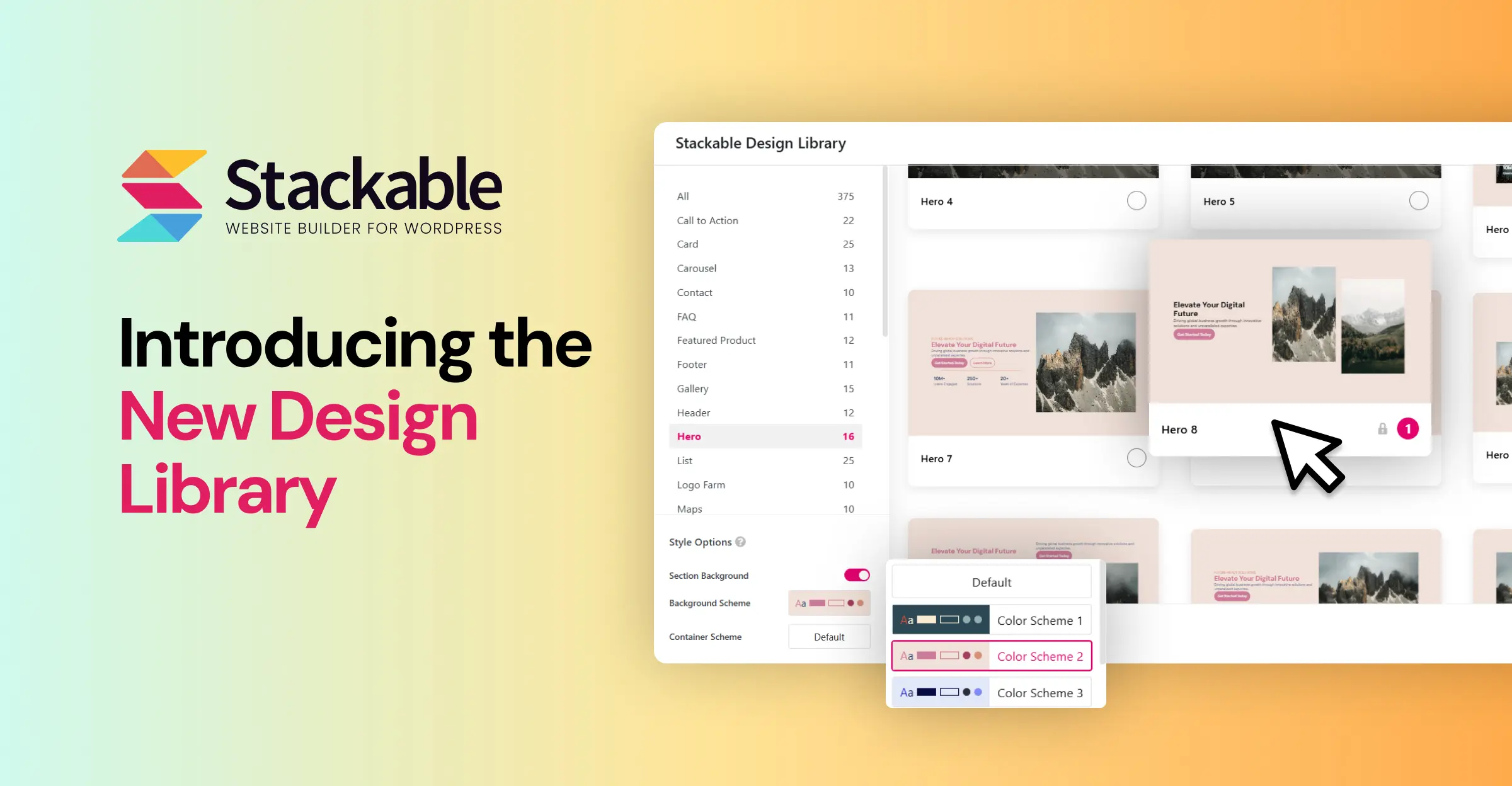
When you open the Design Library from the button from the topmost bar of the block editor, you will now see this:
We’ve simplified the UI of the design library, now it boasts a good list of categories on the left, then the designs on the right.
At the top right corner, you have the refresh library button that allows you to fetch the latest copy of the design library from the cloud (this is done automatically daily, so this is just incase we release something new and it doesn’t appear right away).
You have your new Style Options on the lower left of the design library window. I’ll discuss this further below.
You can click to select one or more designs, then afterwards, add them all sequentially in your page. This makes it very easy to build a flow of a complete web page in a single go.
The Design Library Adjusts to Your Website
Probably the most incredible aspect of the design library is that all the designs adhere to our theme.json support and block style inheritance released a few weeks ago.
Basically, every design inherits styles from your block theme AND your design system, making everything fit your website no matter what block theme you are using.
What’s more is that when you change your block theme, your theme settings or your design system, the design library also adjusts!
Here’s what the design library looks like when using it across different block themes (click on each image to zoom into it):

Design library using the default Twenty Twenty Five theme, click the image to zoom in.

Design library using the Tove theme, click the image to zoom in.

Design library using Spectra One, click the image to zoom in.

Design library using the Catch FSE theme, click the image to zoom in.
Hundreds of Completely New Designs
We have created 375 completely new designs for the new design library.
These all new designs provide you with hundreds of different layout options that you can choose to build your pages on. We’ve designed these so that you can add different designs one after another and they should look great!

One thing to note from the new design library is that we are no longer using the term “UI Kits” — UI Kits were what we called groups of entries in the library that had baked in designs on them.
New Styling Options Within the Design Library
In the new design library, you will find a new section called Style Options on the lower left of the popup.
In this area, one of the things you can do is to turn on or off Section Backgrounds — this essentially turns on the block’s Style Tab > Background toggle. This is very helpful if you want to create alternating sections of different styles.
The background gets the colors from your Global Color Scheme.
Integrated With Color Schemes
In the Style Options, the Section Background, Background Scheme and Container Schemes all come from your Global Color Schemes.
Inside the design library, whenever you adjust the style options, all the designs update to reflect them — making it easy to insert different styled sections.
Here’s a video of me switching between the different color schemes (I’ve previously added this into my Global Color Schemes) and adjusting my entire design library! These changes are all tied up with your global design system, so you can adjust things globally even after inserting designs.
Other Notable Changes
Aside from the amazing features above, here are some changes that are included in this version:
- Since this is a complete revamp of the design library, you will no longer be able to go back to use the older designs.
- V2 blocks will no longer have the ability to change “layouts” in the layout tab. With the heavy changes from the design library, we needed to remove this old feature (it’s cool that we’ve had 4 years of backward compatibility)
Conclusion
Upgrade to v3.17.0 in order to use the newly revamped design library.
If you’re enjoying these stream of updates, please help spread the word in the socials. Let us know what you think of the new design library in our Facebook community!
I hope you enjoy the new design library. Thanks especially to those who participated in the closed beta, your feedback on the Design Library was invaluable in making this update our best one yet. Stay tuned for a lot more innovations to come.
Keep on Stackin’!
So no complete website designs going forward? Kind of a bummer
There definitely will be!
I’ve been having an issue for a while now where no Design Elements can be found on any of my installations, and it’s happening across different servers. I’ve already tried the usual troubleshooting steps, but nothing seems to work.
Has anyone else run into this or found a potential fix?
Hello, please update to the latest version of Stackable, then please click on the “refresh” button on the upper right area of the Design Library. That should fix things!